Music Theory App
Interactive, bite-sized music theory lessons for learners of every level
Project Overview
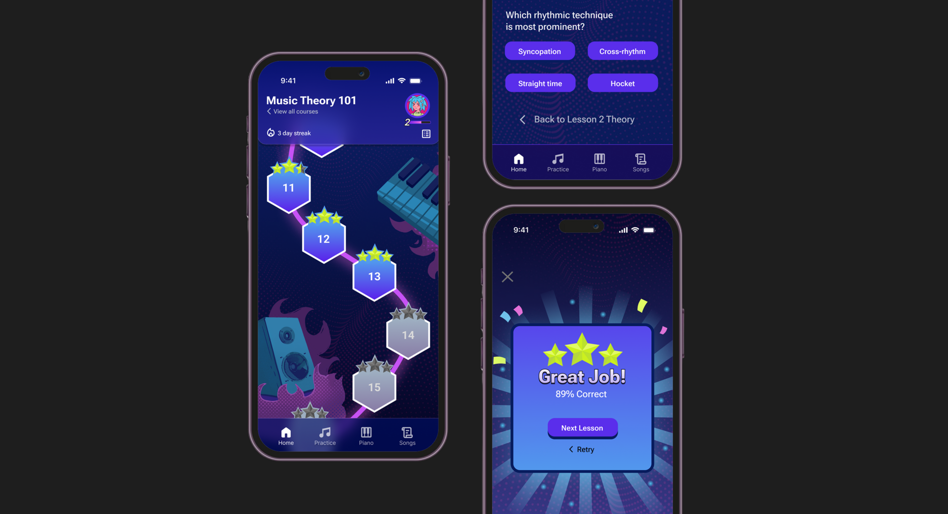
Music Theory is a mobile app designed to teach the fundamentals of music theory through easy-to-digest, interactive lessons. It transforms what can be a complex and intimidating subject into an engaging learning experience that fits seamlessly into users’ daily lives.
Problem Statement
Many existing music theory tools suffer from low user interaction, lack of motivation for learners to return regularly, and overly complex content that overwhelms beginners. This app addresses these issues by creating a fun, effective, and interactive learning environment that improves attention, boosts understanding, and encourages consistent progress.
Target Audience
The app is designed for learners aged 12 to 61 and beyond, from students to lifelong learners. It caters to digitally savvy users who prefer to study at their own pace or supplement classroom learning with engaging mobile content.
Team Members
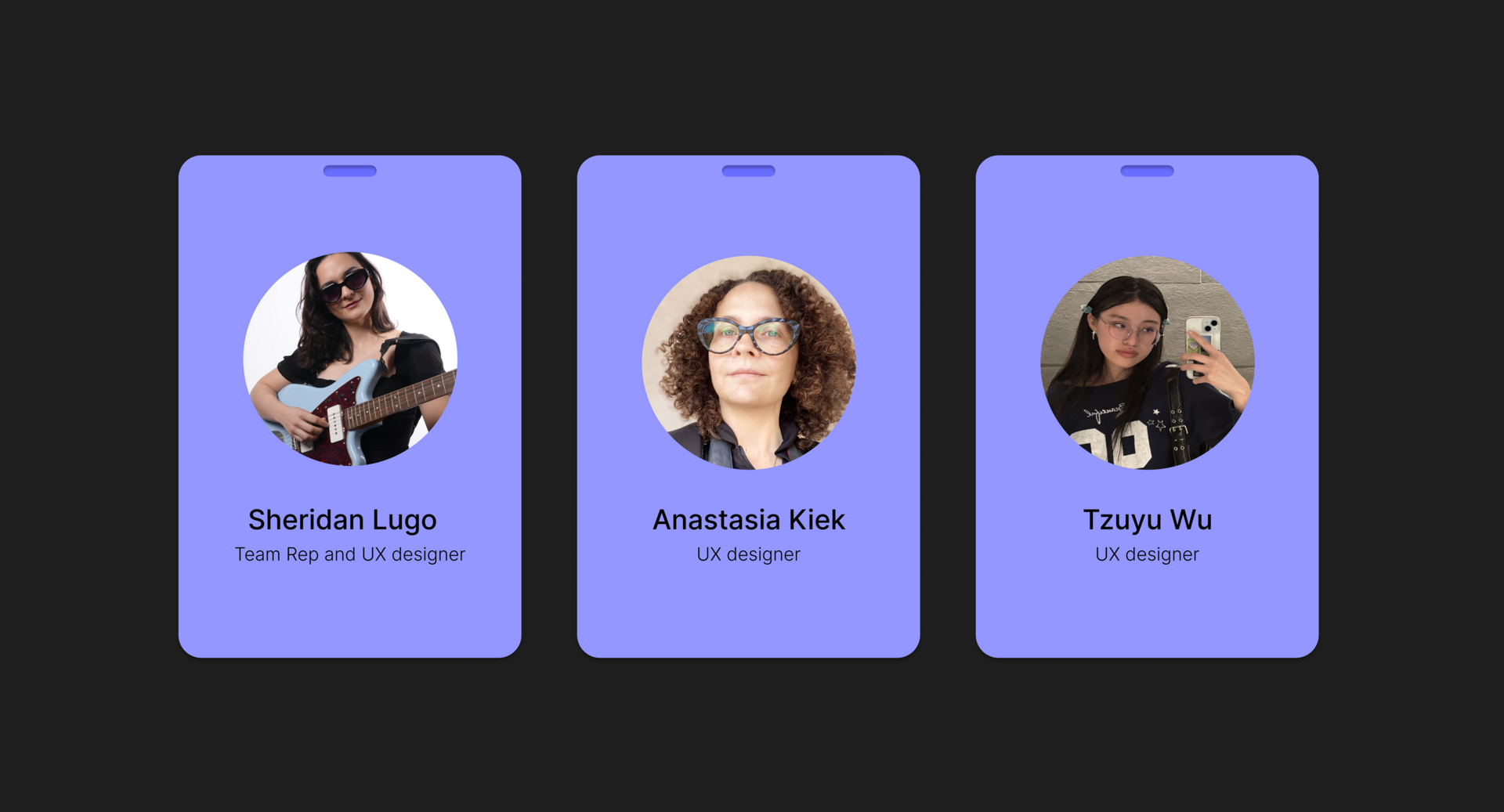
- Sheridan Lugo, Team Rep and UX Designer
- Anastasia Kiek, UX Designer
- Tzuyu Wu, UX Designer
Mood Board
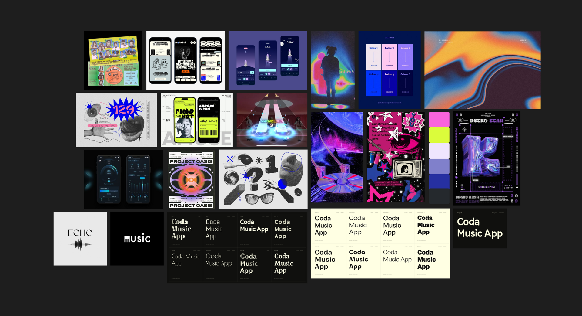
This mood board sets the visual tone for a Music Theory app that breaks away from traditional, academic aesthetics. Inspired by punk culture and rhythm game visuals, the design emphasizes energy, edge, and immersion. It aims to engage users emotionally and visually while keeping the learning experience smooth and intuitive.
User Research
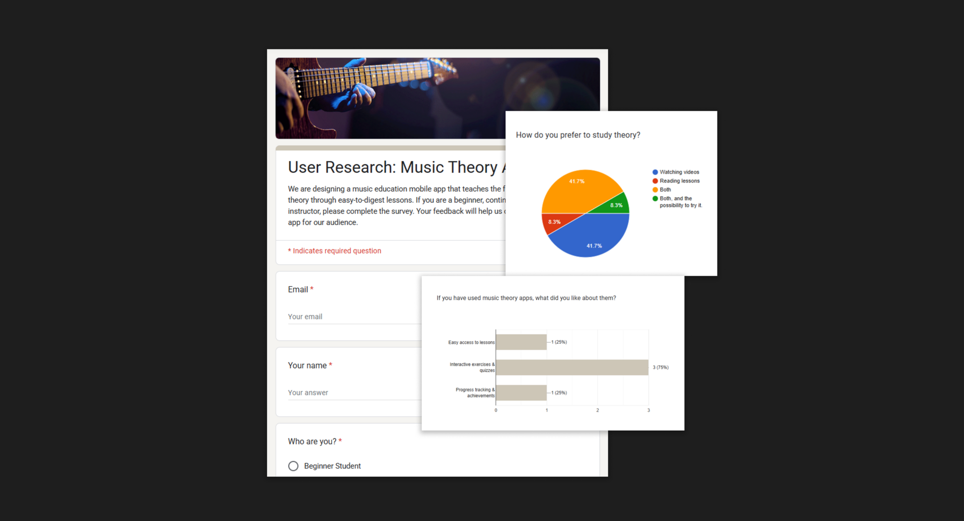
We interviewed 23 individuals, including beginners, intermediate music students, and a music instructor. From this research, we identified four key insights:
- Integrate practice with learning
- Focus on ear training and harmony
- Personalize the learning path
- Keep it visual and interactive
Personas
Users of this music theory app seek an engaging, flexible, and clear learning experience that motivates consistent progress. They value lessons that balance simplicity with meaningful interaction, avoiding overwhelming complexity and rote memorization. Additionally, educators look for tools that make theory practical and visually accessible, helping to boost student motivation and deepen understanding through hands-on, interactive approaches. Overall, the app aims to create a supportive environment where learners of all levels can thrive and stay inspired.
Persona: Beginner students
Beginner music students need fun, flexible lessons that fit their schedule and keep them motivated. They’re driven by progress, enjoyment, and clear, simple instruction.
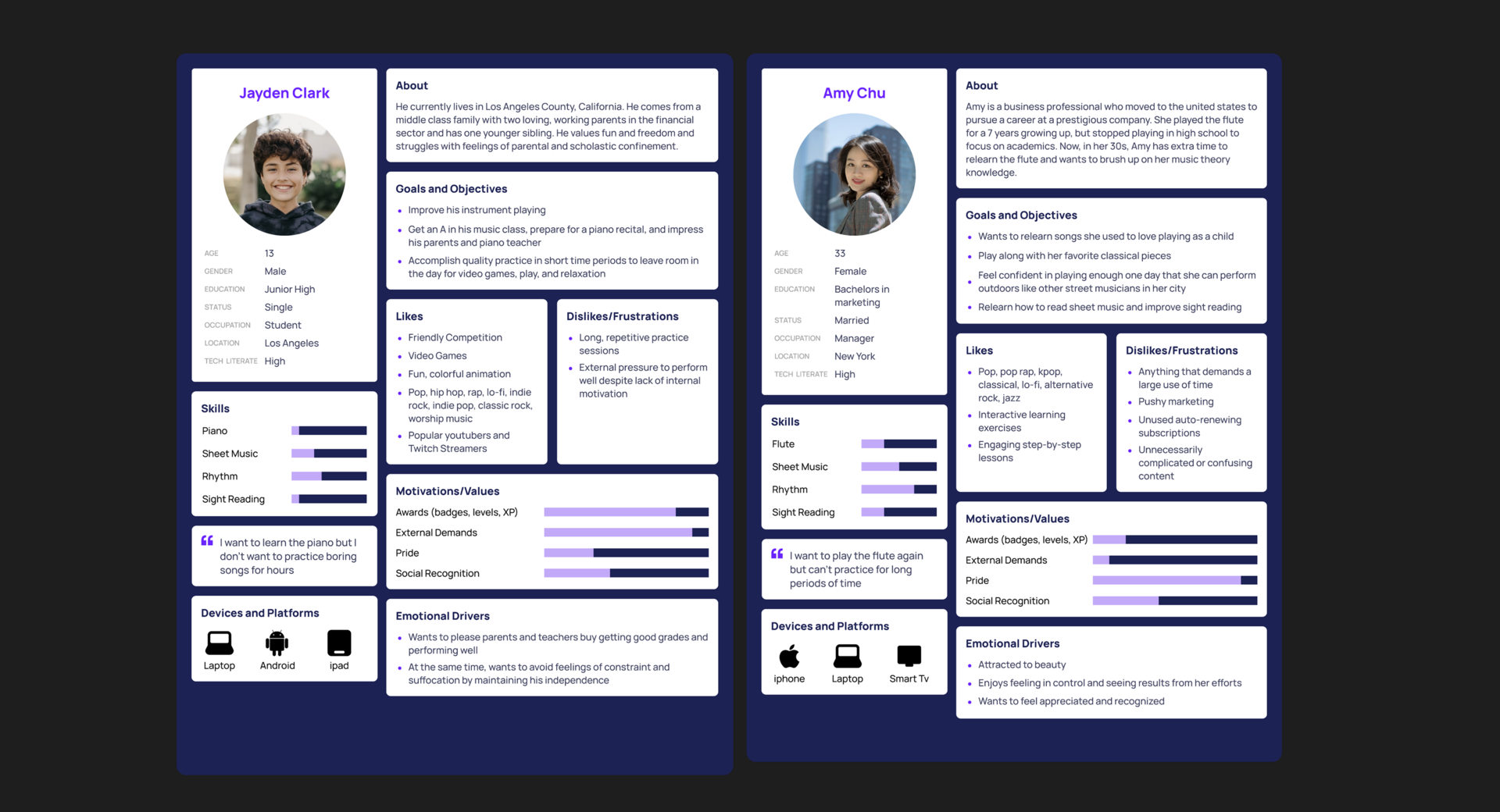
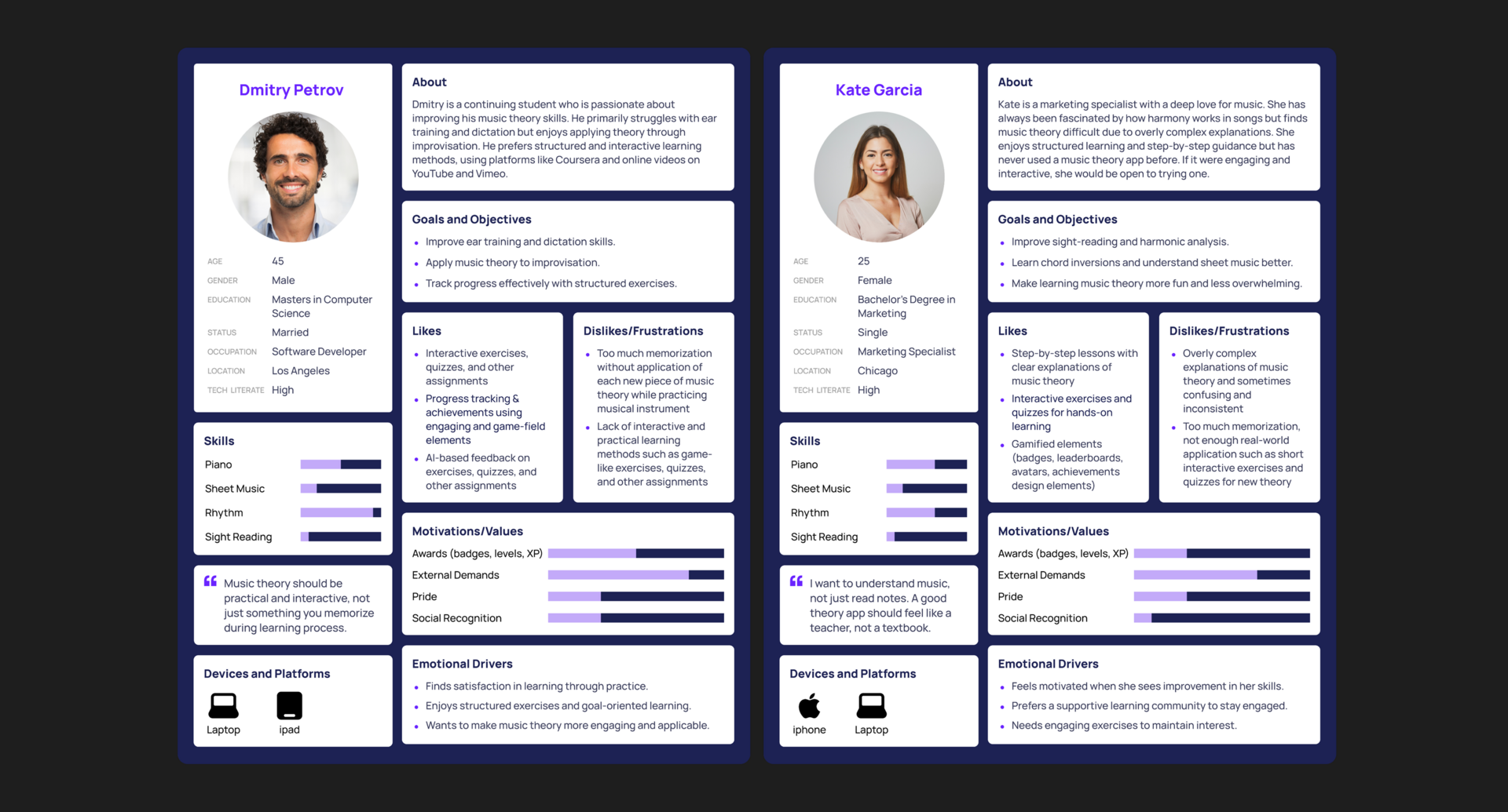
Persona: Intermediate students
Intermediate music students seek structured, interactive learning with clear goals and real-world application. They’re frustrated by overly complex theory, excessive memorization, and a lack of engaging, hands-on practice.
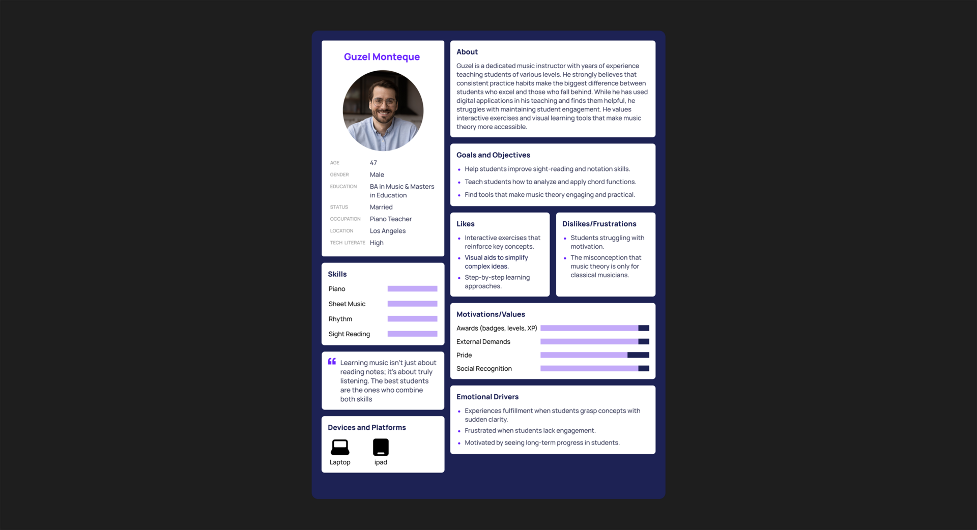
Persona: Music instructor
Music instructors value tools that make theory more practical, engaging, and easy to understand for students. They’re frustrated by low student motivation and seek interactive, visual methods to boost clarity and long-term progress.
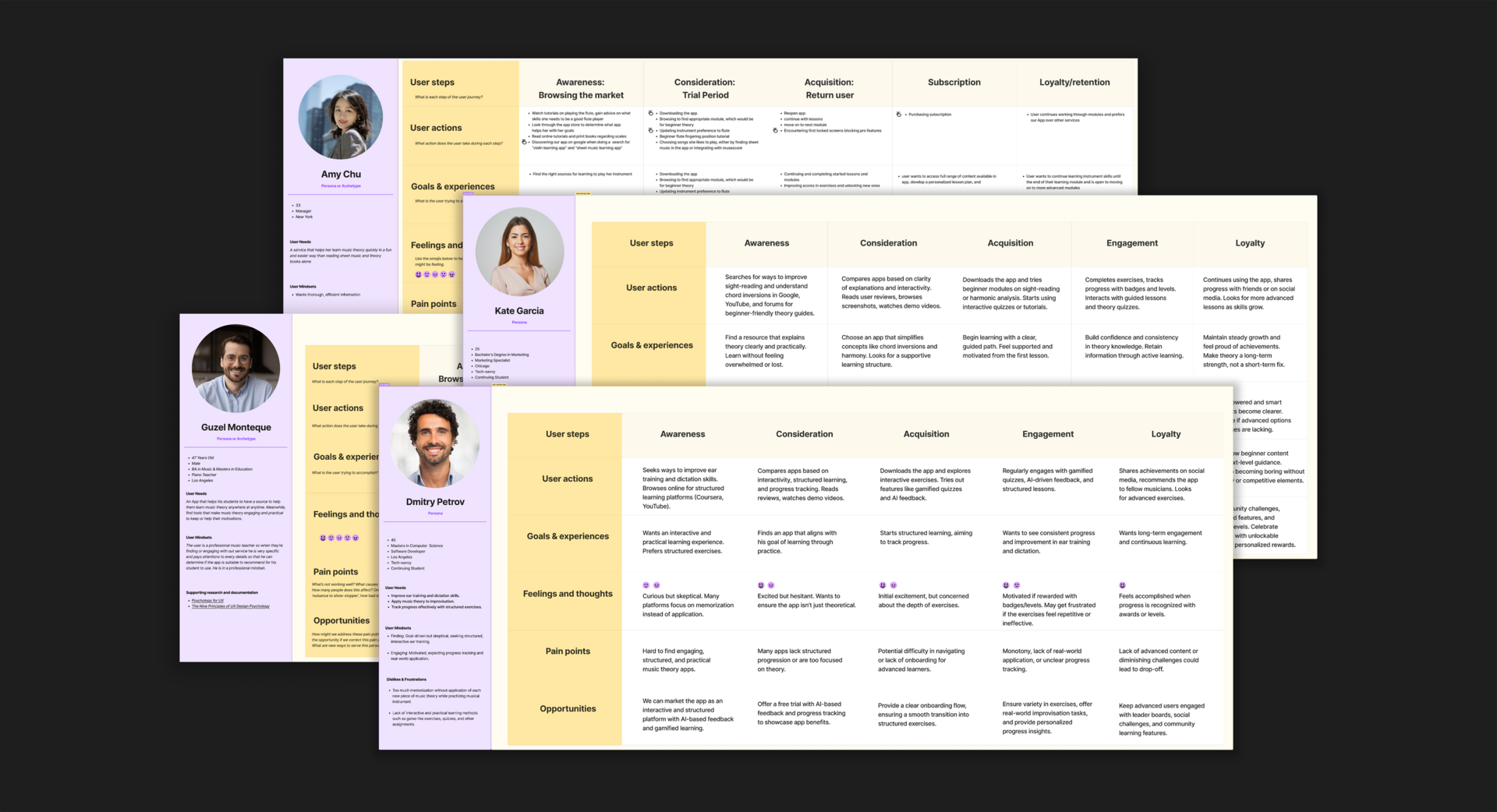
User Journey Maps
Beginners need a simple, encouraging start, while intermediate users look for measurable progress and personalized feedback. Teachers seek tools to assign tasks, track student progress, and integrate lessons with digital practice. These insights highlight key opportunities to improve onboarding, motivation, and support across all user levels.
User Flows
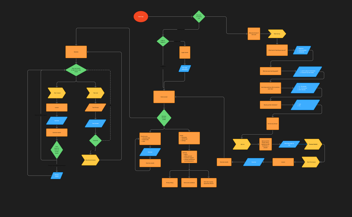
The user flow chart shows separate lesson paths for beginners and intermediates. Each lesson includes short theory content (readings and videos) followed by interactive quizzes and tests. Users get instant feedback and can skip or repeat any part.
Wireframes
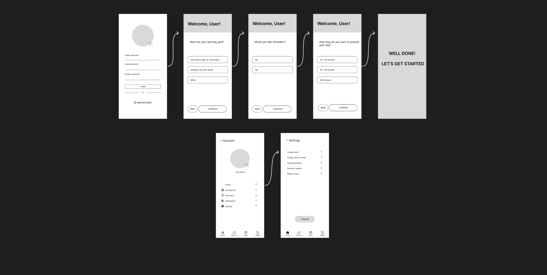
Profile, Settings, Survey
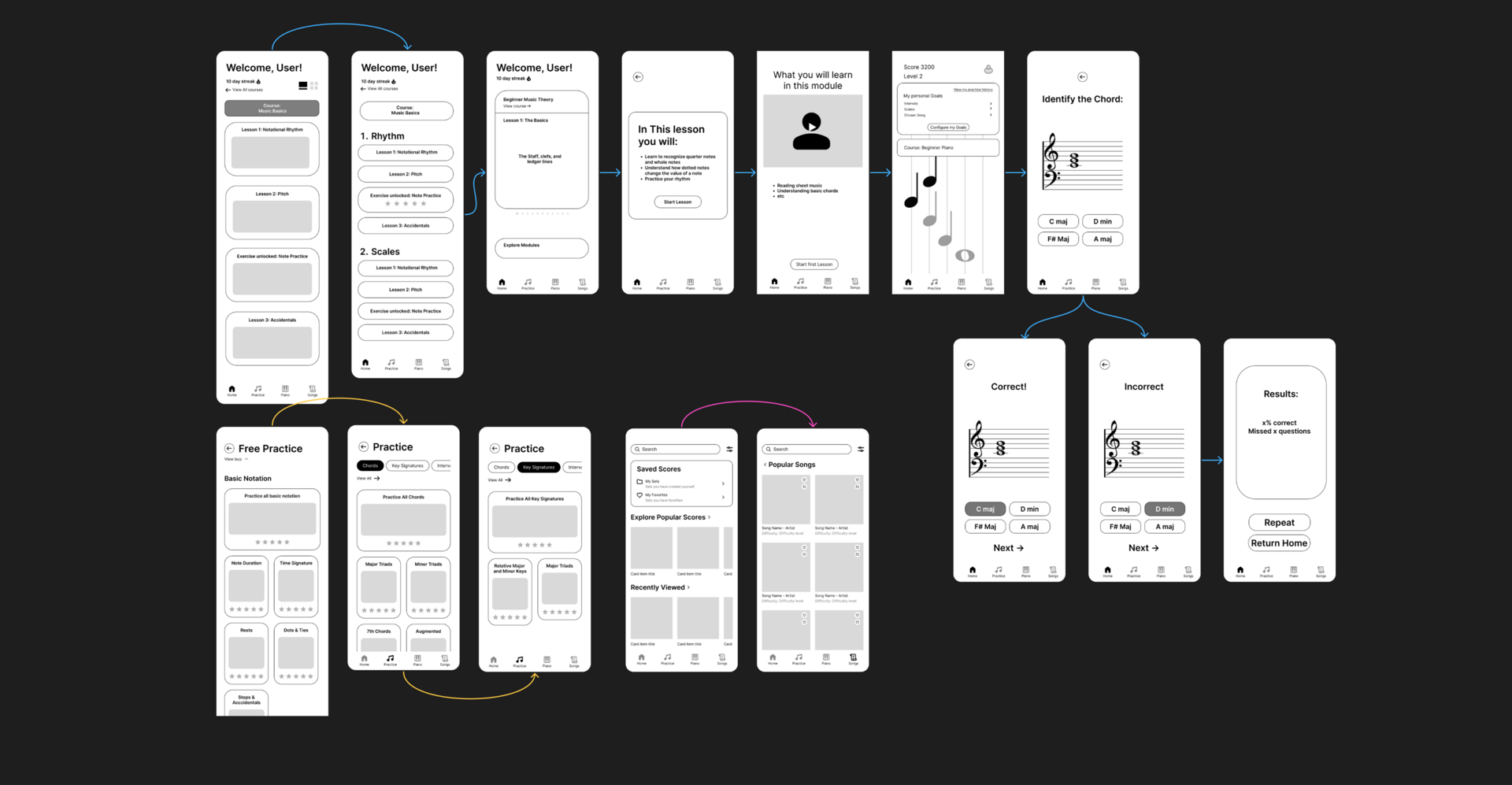
Home Page, Practice Tab, Songs Tab
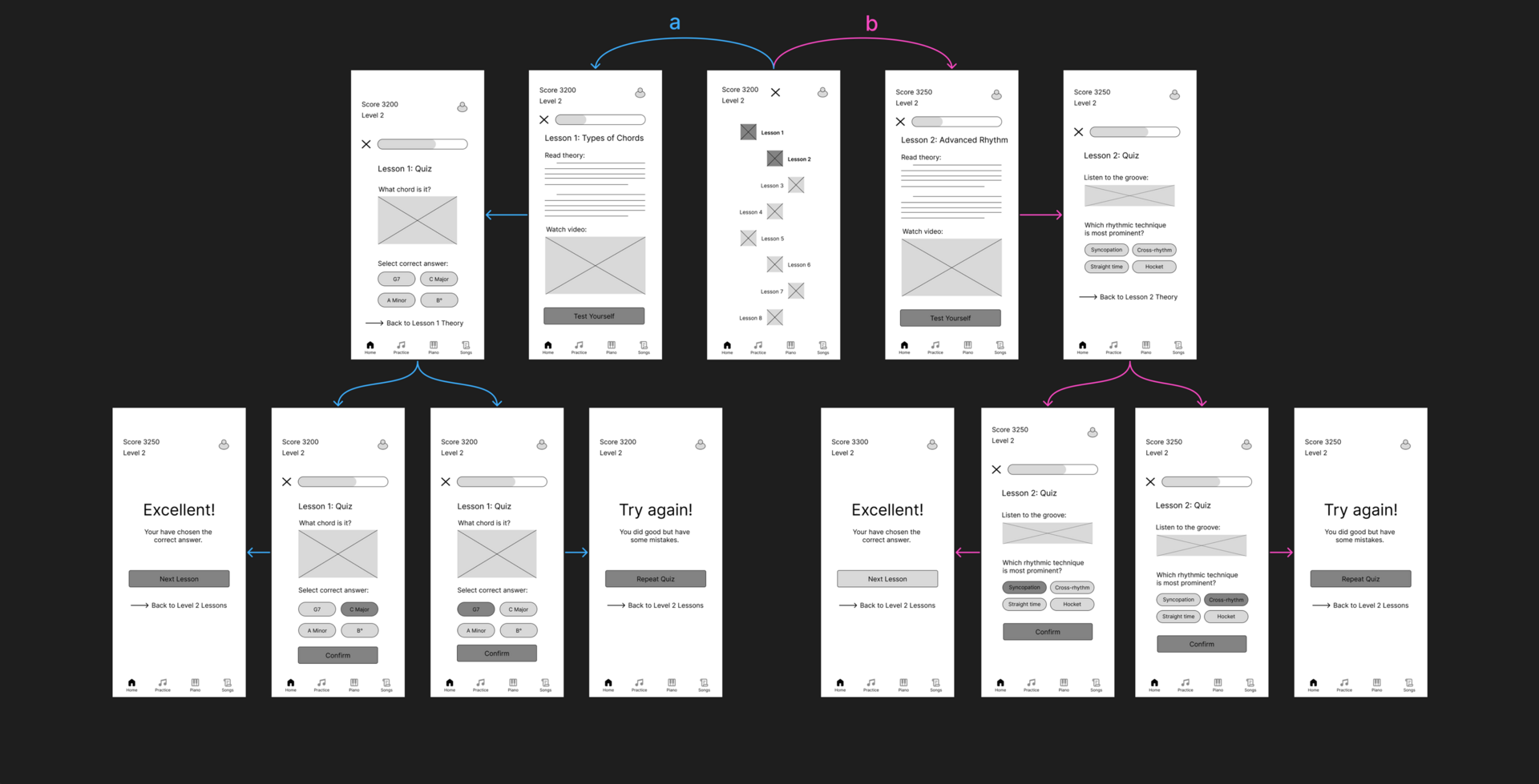
Intermediate Lessons
Usability Study
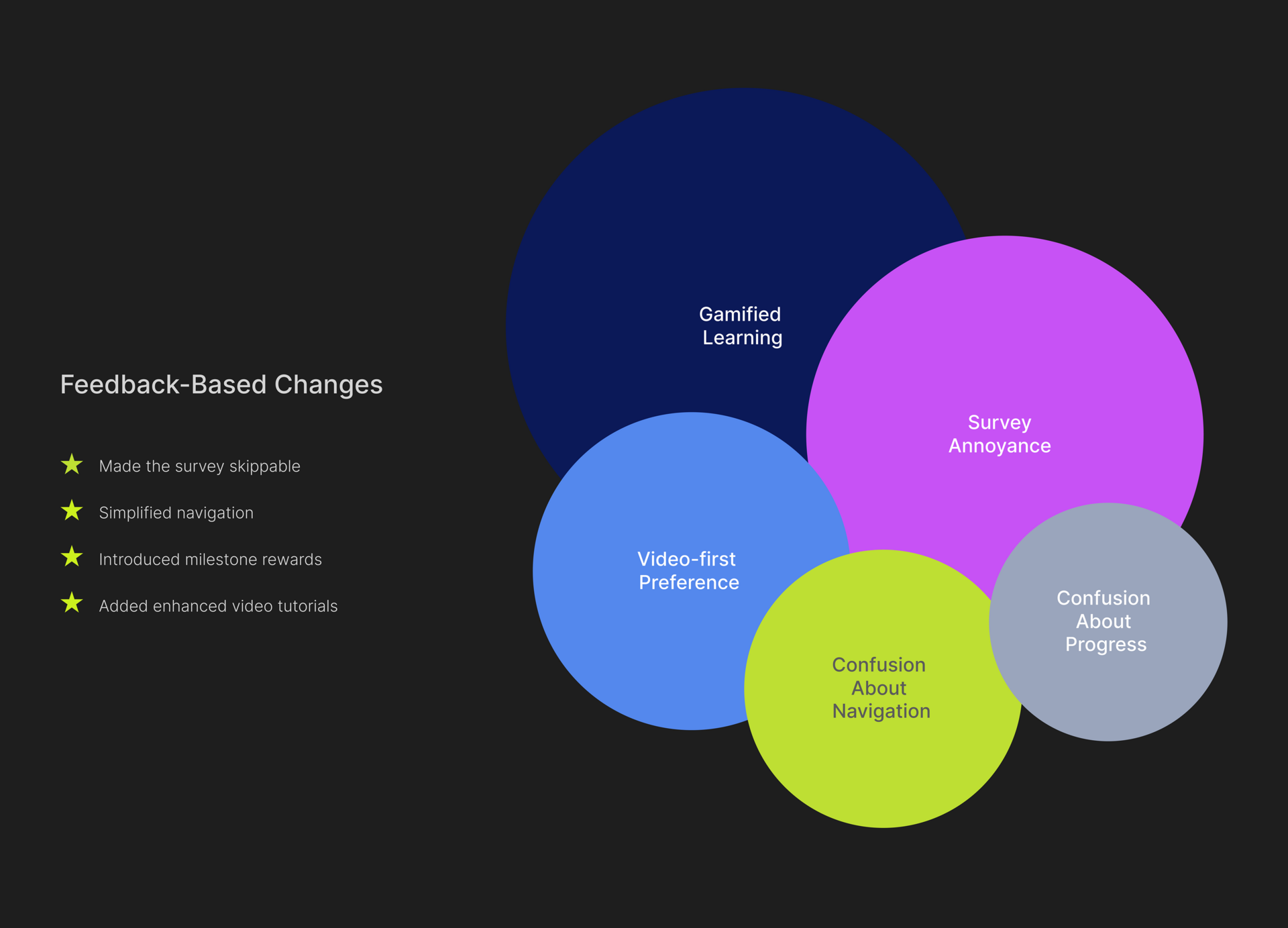
7 users participated in our interviews. Users consistently enjoyed gamified learning features and found motivation in locked and unlocked lesson progressions.
Many expressed frustration with onboarding surveys and requested clearer lesson flow, video-first content, and more interactive elements.
Based on this feedback, we decided to make the survey skippable, simplify navigation, and introduce milestone rewards and enhanced video tutorials.
Design Variations
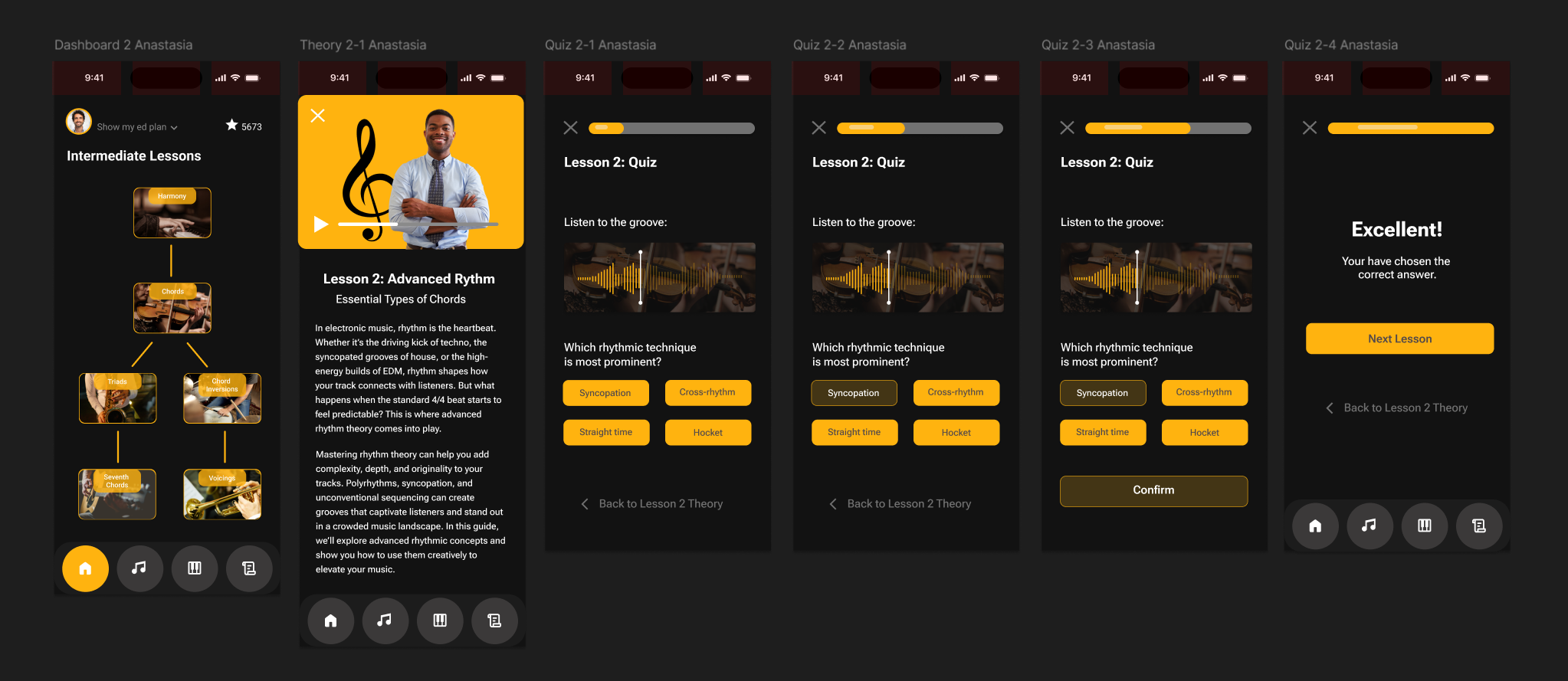
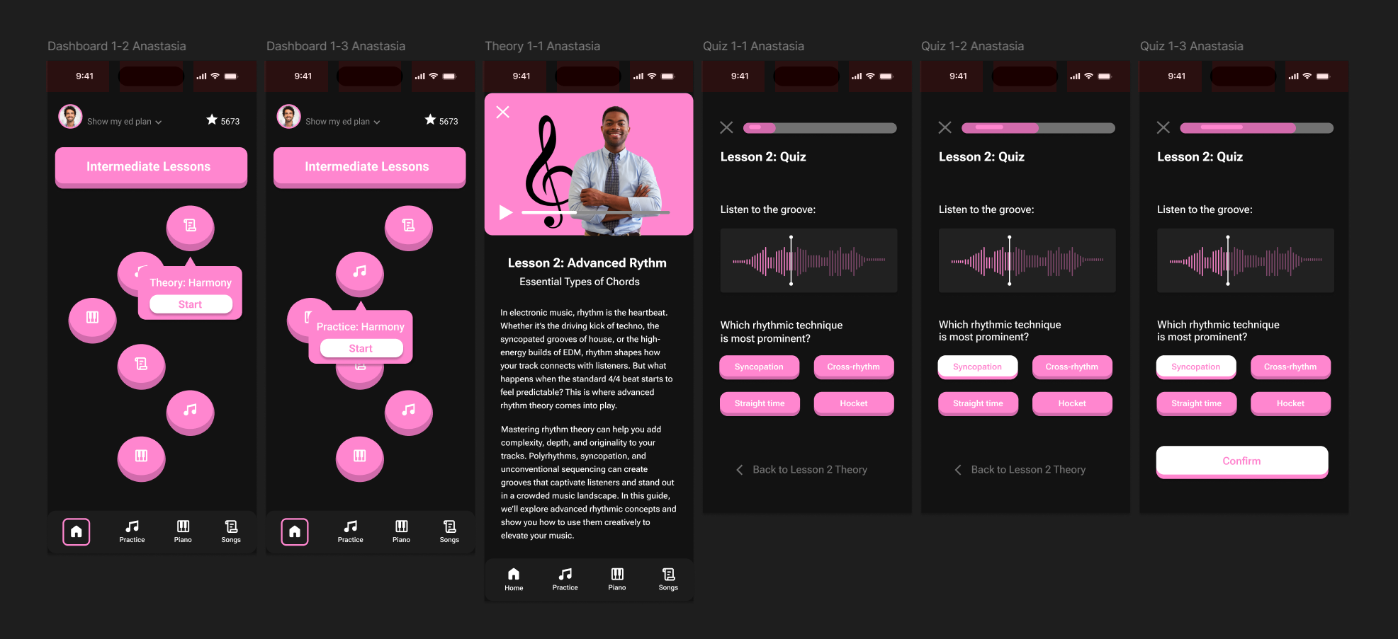
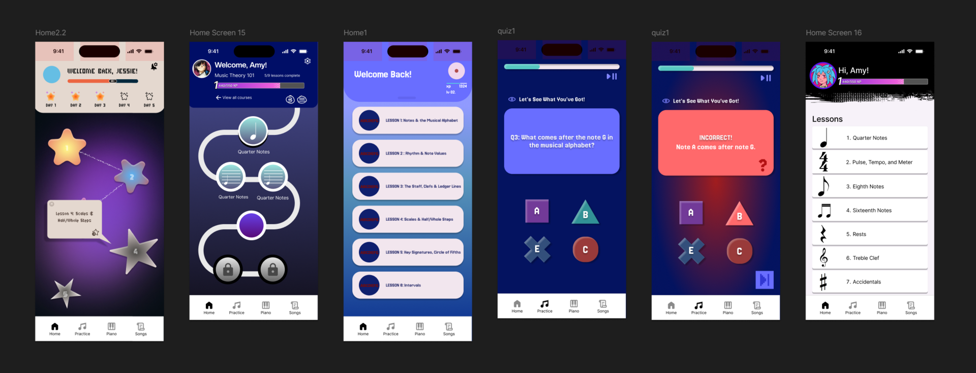
We explored a series of design variations, focusing on enhancing user engagement through distinct visual styles, interaction patterns, and learning flows.
Each direction experiments with different aesthetics, from bold and high-contrast interfaces to playful, gamified layouts, while maintaining consistency in navigation and content structure.
We developed the variations to test how visual tone and interface design can influence user motivation, accessibility, and learning outcomes across lessons, quizzes, and dashboards.
Design System
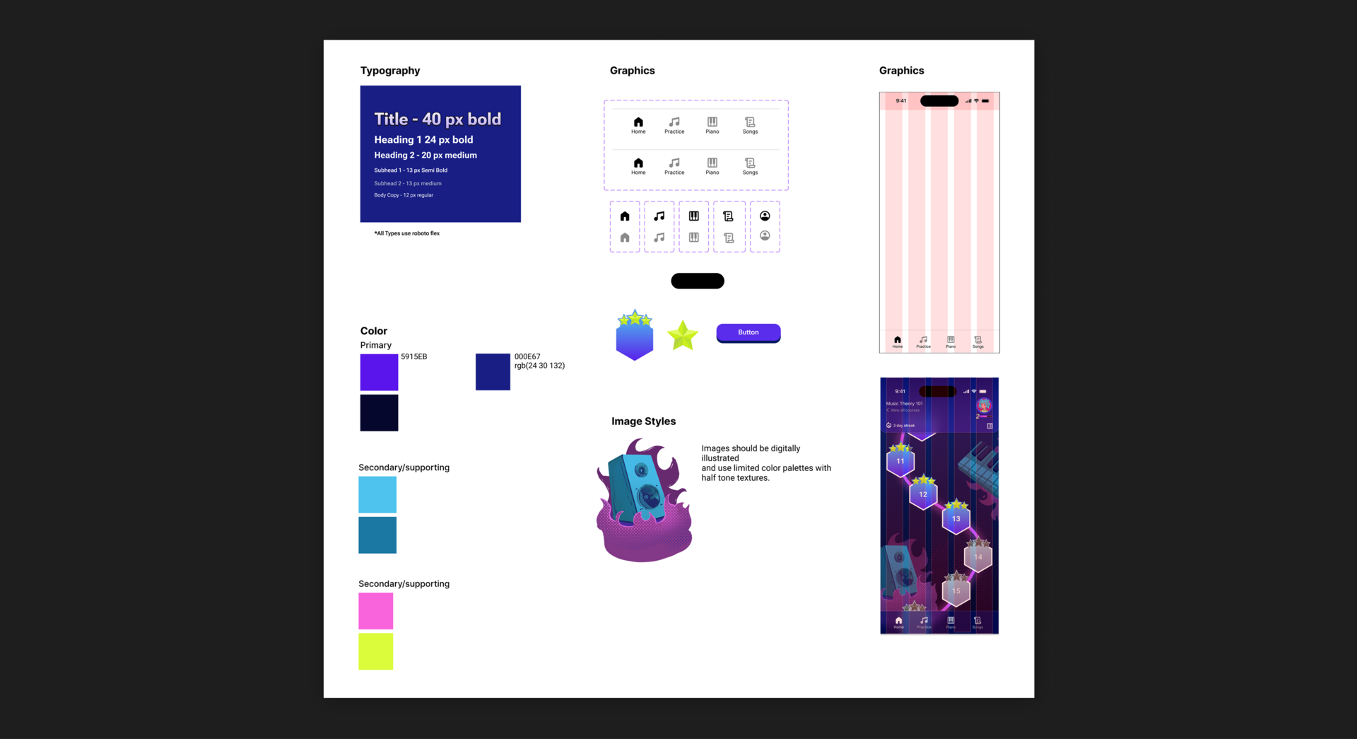
We developed a playful and cohesive design system to support the visual identity of the music education app. We chose a vibrant primary color palette featuring purples and electric blues, paired with neon-inspired secondary colors to enhance engagement and reflect the app’s gamified tone.
All typography is set in Roboto Flex for flexibility and legibility across devices, with clear hierarchy ranging from bold 40px titles to regular 12px body text.
We designed custom icons and UI components with rounded edges to maintain a friendly, approachable aesthetic. Our image style emphasizes digital illustrations with halftone textures and limited color palettes to ensure visual consistency.
We also established a structured 8-column grid to support responsive layouts across screens. This design system ensured consistency across design variations while allowing flexibility for creative experimentation.
Prototype
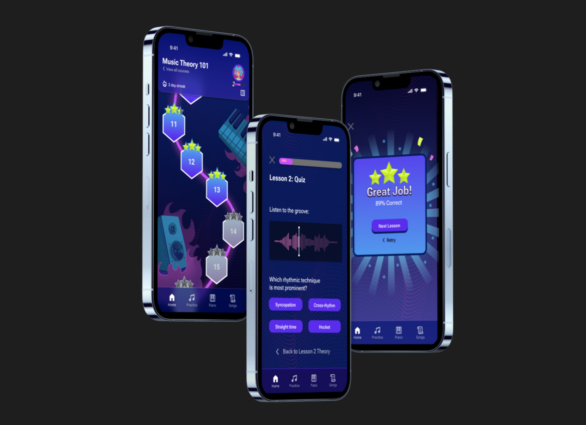
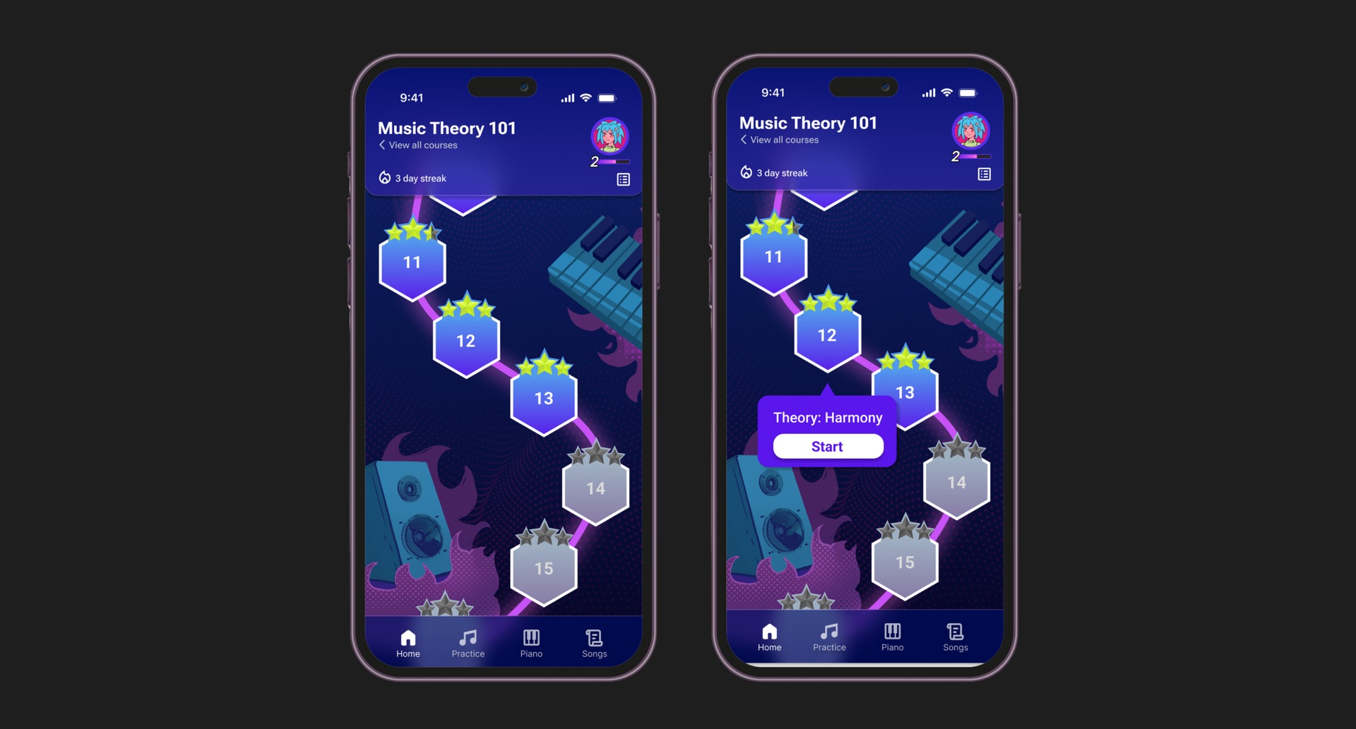
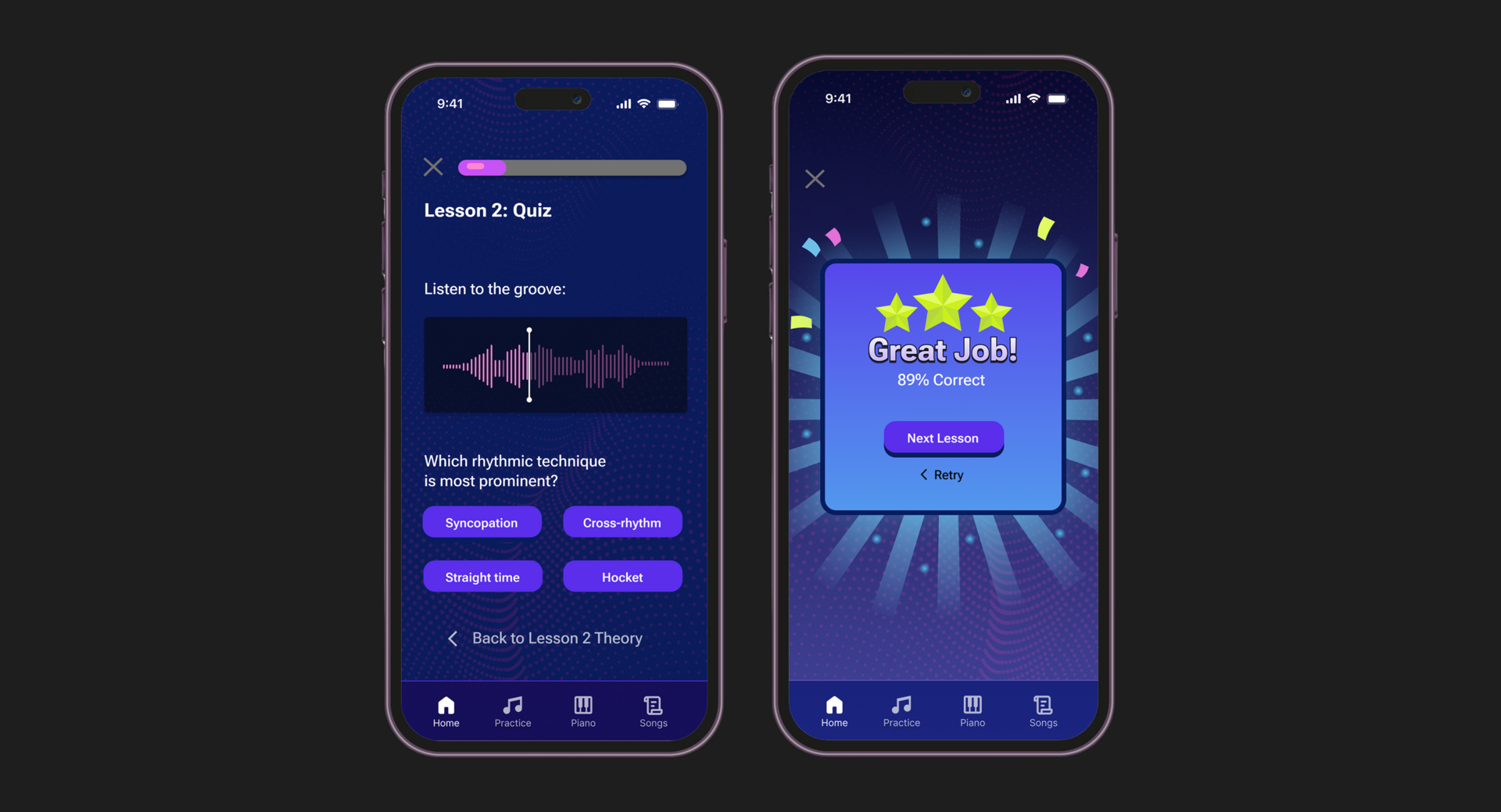
We created an interactive prototype to demonstrate the full user journey through the app from onboarding and lesson selection to theory modules and quizzes. Our goal was to test both usability and engagement, ensuring smooth navigation and intuitive interactions across all screens.
The prototype includes animated transitions, audio playback controls, and real-time quiz feedback to reflect the dynamic learning experience. By linking all core features into one cohesive flow, we were able to validate design decisions, gather feedback early, and make informed iterations before development. This prototype also served as a communication tool for stakeholders, clearly illustrating the product vision and user experience.
Tools: Figma