Velover App
A bike-sharing app to rent and lend bicycles anytime, anywhere
Project Overview
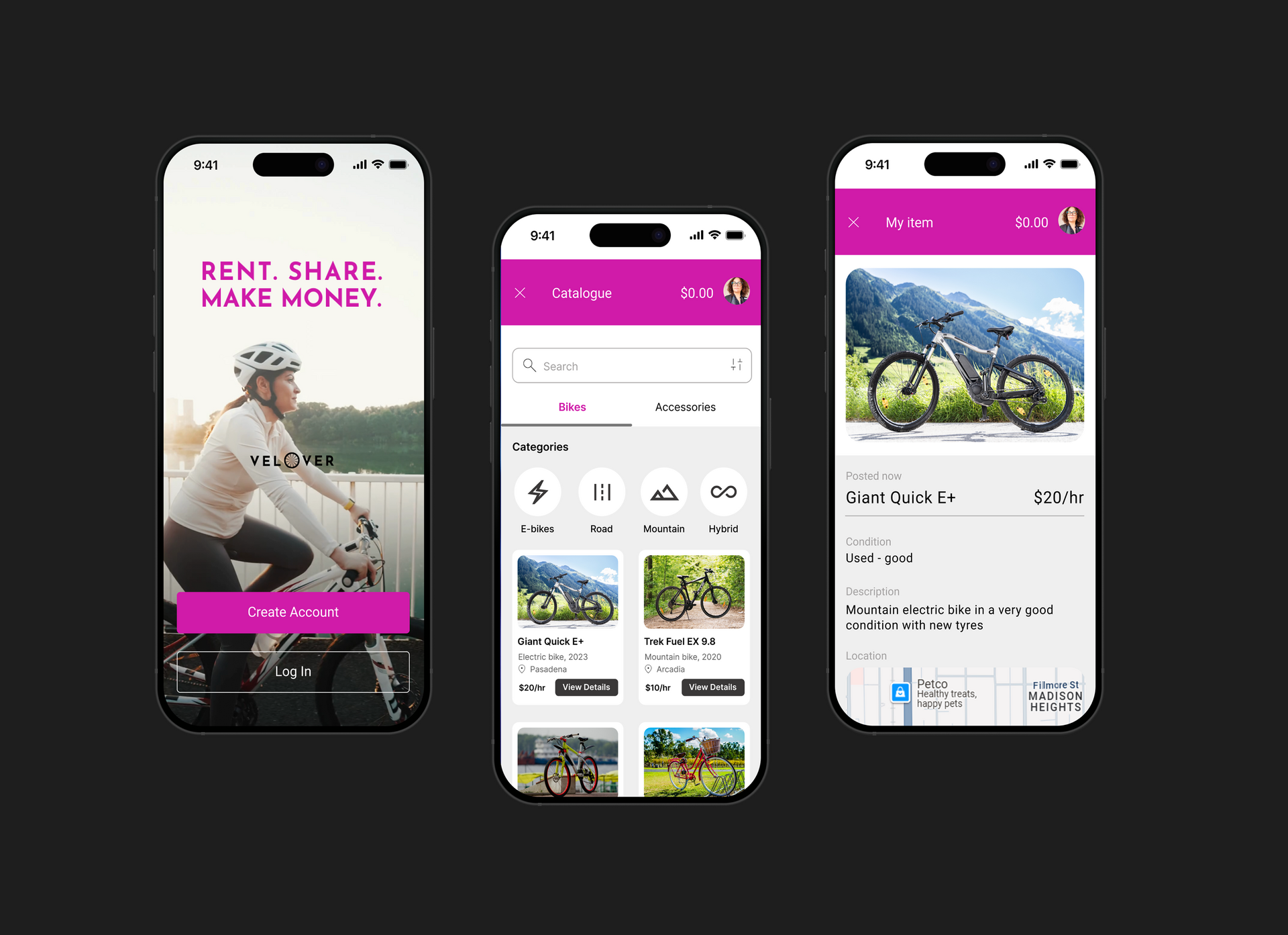
Velover is a bike-sharing app that lets you rent and borrow bicycles anytime, anywhere. Whether you're commuting, exploring the city, or just enjoying a casual ride, Velover connects you with nearby bikes in seconds. Velover is like Airbnb, but for bike enthusiasts.
Mood Board
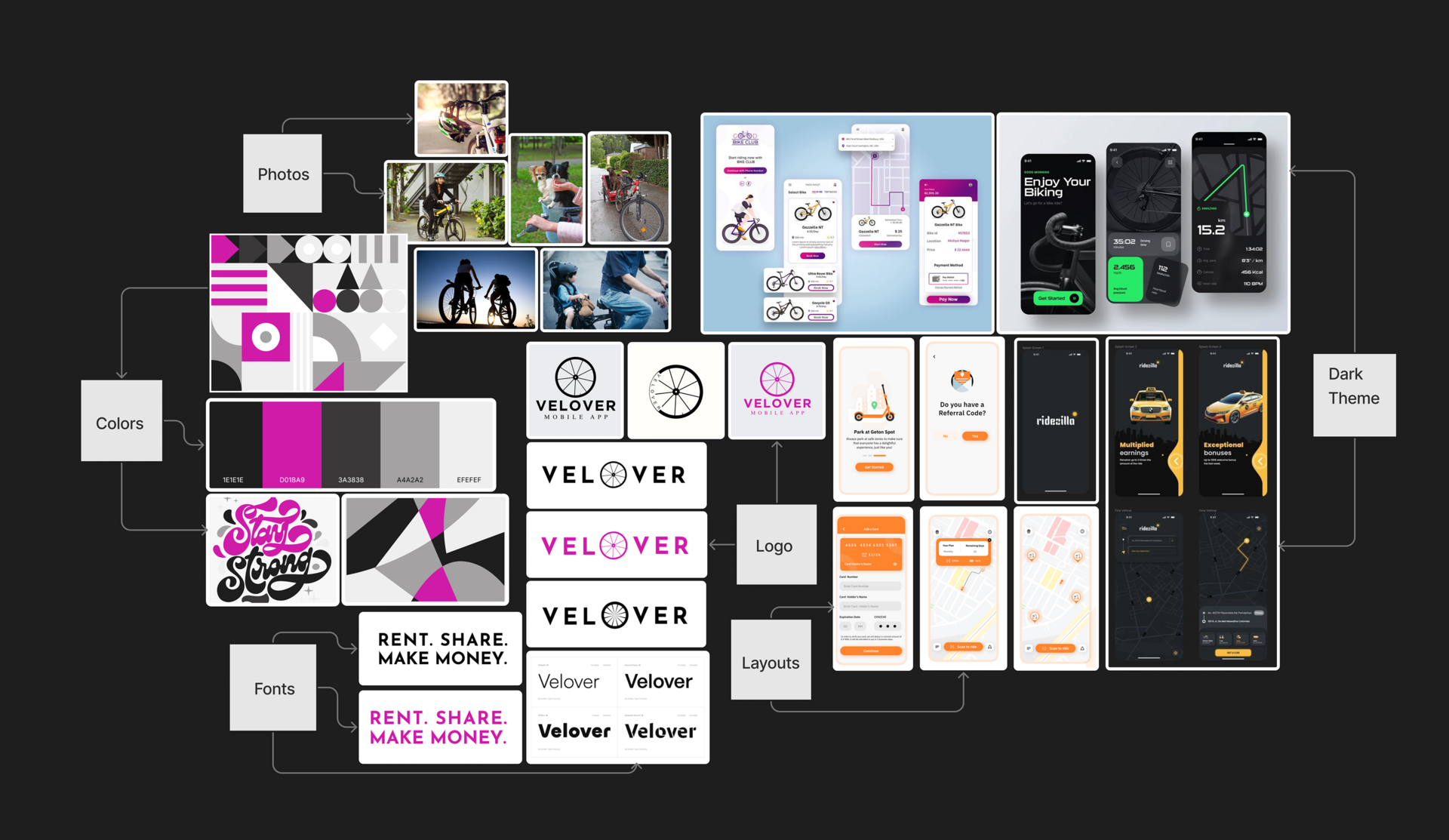
This mood board reflects the visual identity and design language for the Velover mobile app, combining playful energy with professional clarity.
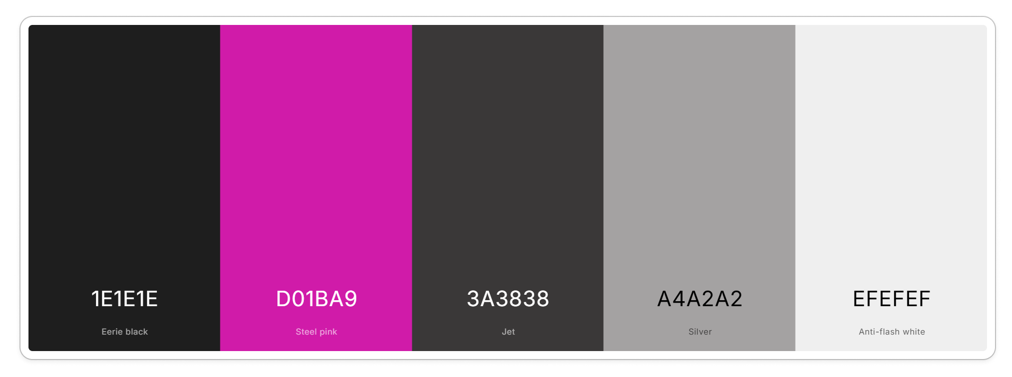
The color palette consists of five main tones:
- #1E1E1E Eerie Black: used for backgrounds and dark themes to create contrast and depth.
- #D01BA9 Steel Pink: a bold accent color that adds vibrancy and highlights key UI elements.
- #3A3838 Jet: a supportive dark tone for structure and subtle contrast.
- #A4A2A2 Silver: adds softness and balance to the palette.
- #EFEFEF Anti-flash White: clean and neutral, perfect for light backgrounds and contrast.
These colors are applied consistently across logos, illustrations, and UI screens to ensure harmony and brand recognition.
The typography blends bold, modern sans-serif fonts for headlines and clean, readable typefaces for body text. The fonts emphasize clarity and hierarchy, supporting user-focused design. Slogans like “RENT. SHARE. MAKE MONEY.” are styled with high contrast for visual impact.
The photography captures dynamic and friendly moments of cycling: individuals, groups, and families riding bikes. These images build an emotional connection and support the brand’s community-oriented mission.
Multiple logo iterations explore different styles, from minimal black-and-white to full-color versions with the signature steel pink accent. The wheel icon integrates seamlessly into the wordmark, visually linking the brand to its core function: biking.
Layouts include light and dark UI variations. The light theme focuses on clarity and ease of use, while the dark theme brings a sleek, tech-savvy look ideal for advanced or nighttime modes. The modular layout structure supports consistent navigation and scalable design across screens.
User Flow
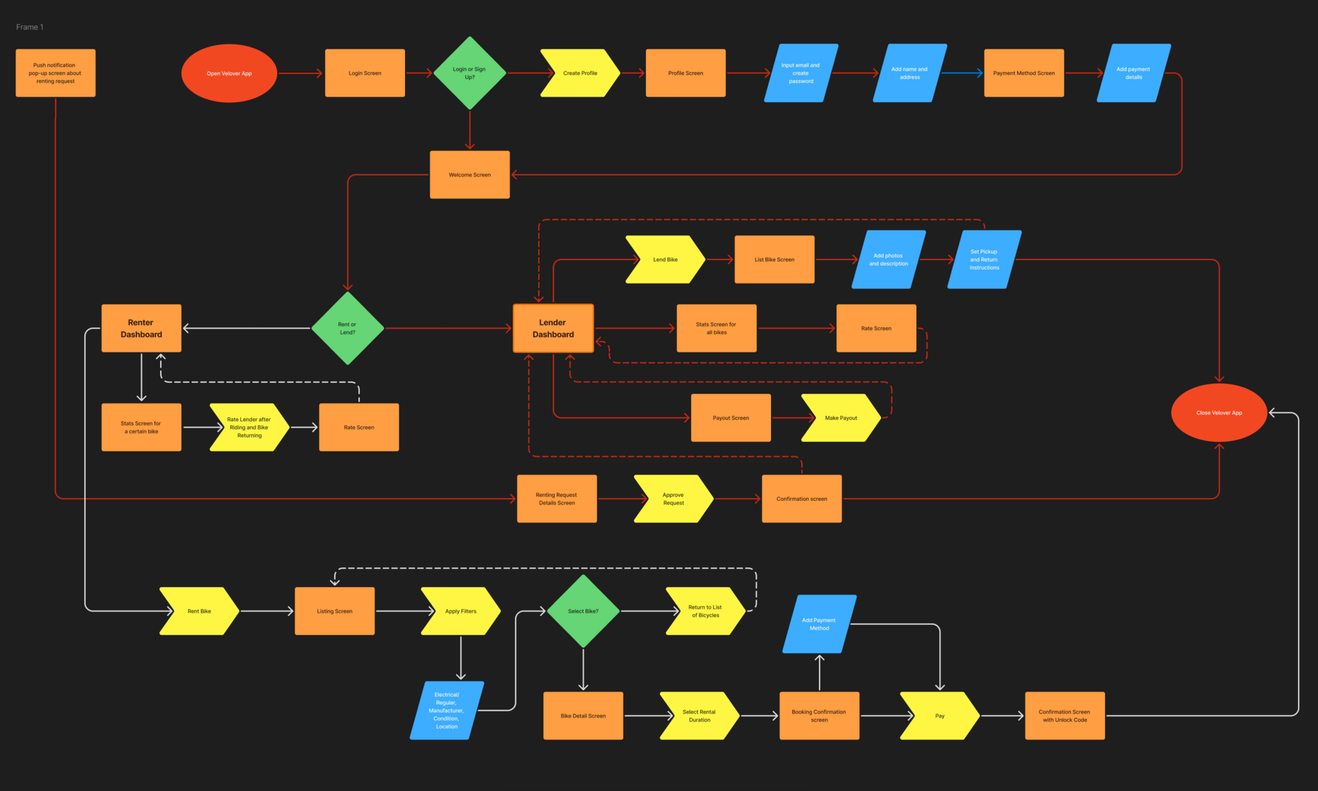
The user flow outlines the full journey for both renters and lenders, from account creation to completing a bike transaction. It maps key screens such as profile setup, bike listing, applying filters, booking, and payment. The flow clearly separates the renter and lender paths while highlighting shared checkpoints like login, dashboards, and confirmation screens. This structure ensures a seamless and intuitive user experience across both roles.
Paper Wireframes
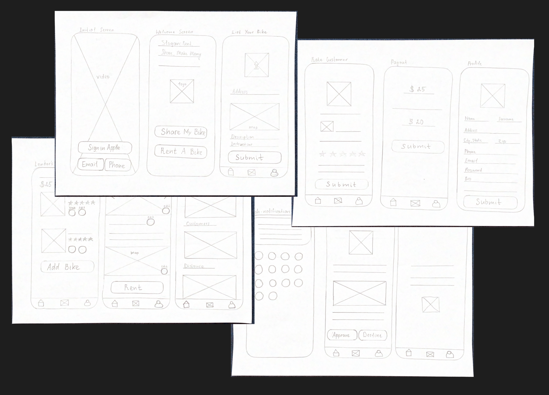
The initial paper wireframes helped visualize the core structure and layout of Velover’s main screens. These low-fidelity sketches mapped out key user actions, such as signing in, renting or listing a bike, viewing dashboards, and making payments. Designing on paper allowed for rapid iteration and early testing of navigation flow, screen hierarchy, and user roles. This stage laid a strong foundation for building intuitive and efficient digital wireframes.
Digital Wireframes
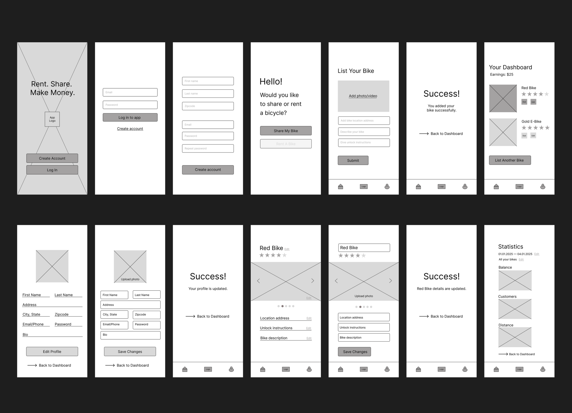
The digital wireframes present a refined layout of the app's key screens based on the initial sketches. They include core user actions such as signing up, listing a bike, editing a profile, and viewing the dashboard. The wireframes focus on usability and clear navigation while maintaining consistent UI components. This stage helped validate the user flow and interface structure before moving into high-fidelity design.
Usability Testing
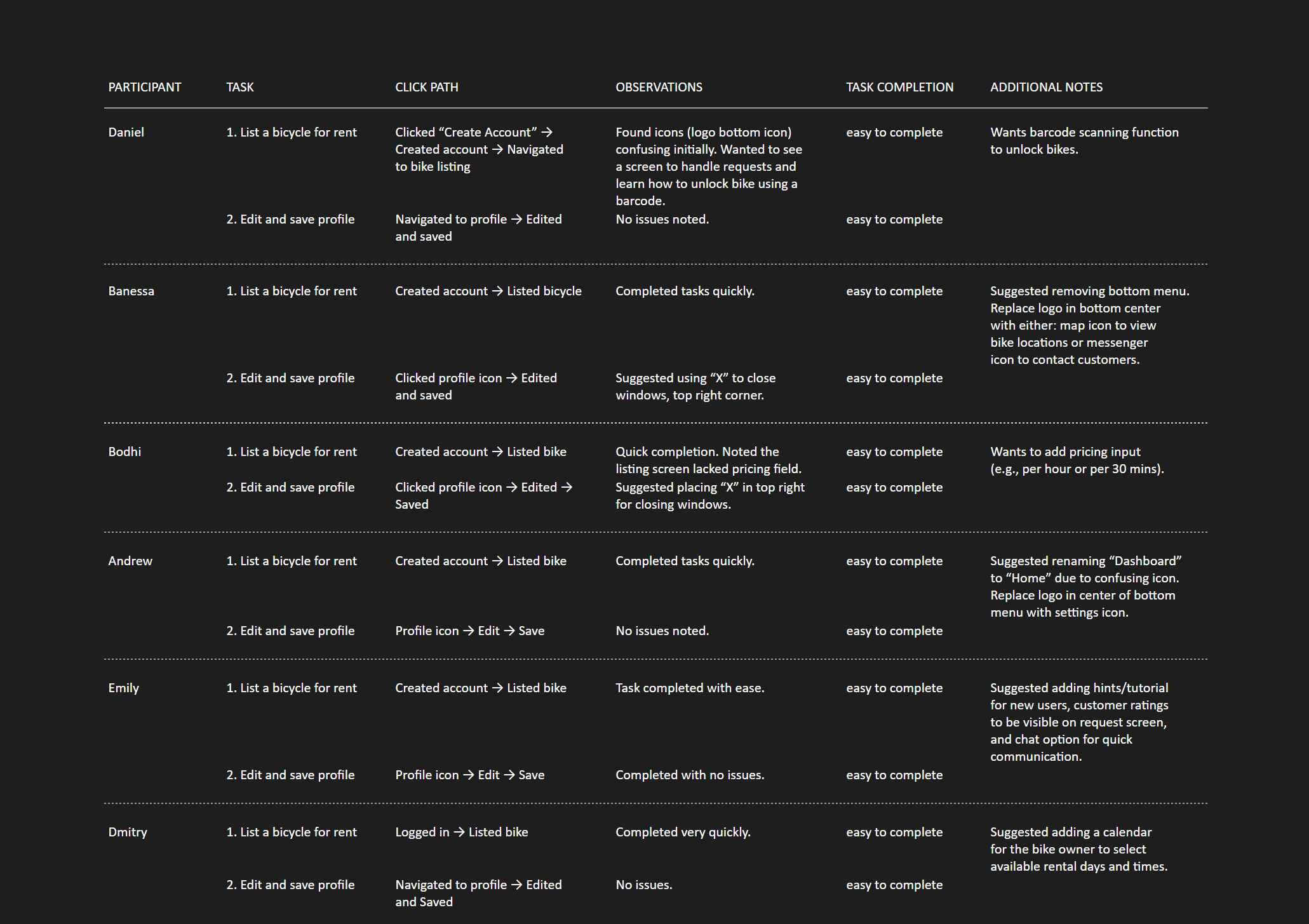
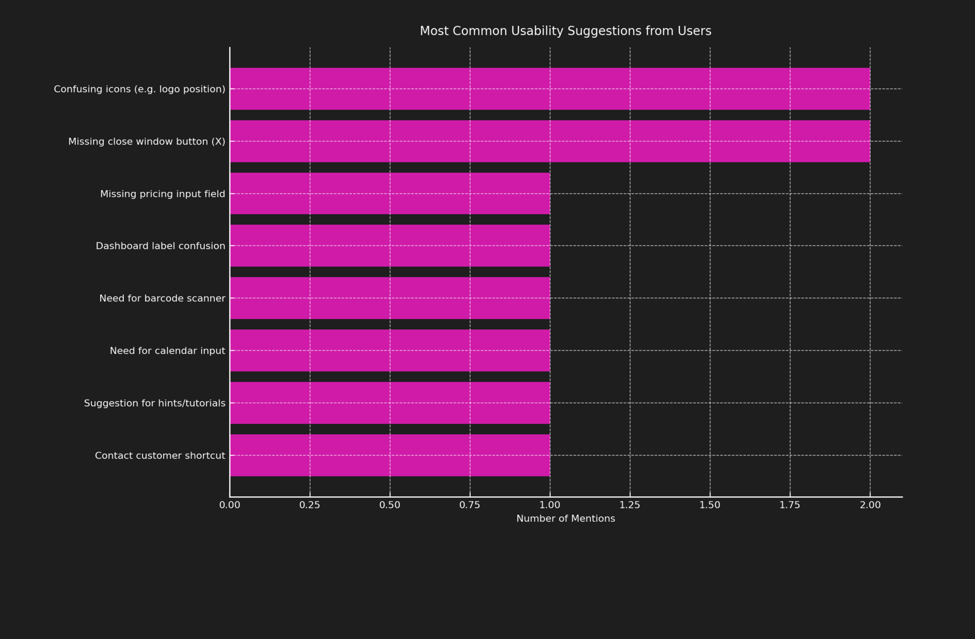
Usability testing was conducted with six participants who performed two main tasks: listing a bike and editing their profile. All users successfully completed the tasks with ease, highlighting the intuitive flow and clear interface. Feedback included helpful suggestions such as adding a barcode scanner, pricing input, or calendar selection, and improving icon placement and labels. These insights guided design refinements to improve clarity, user onboarding, and overall app functionality.
Planned Updates After Usability Testing
- Replace the logo icon on the bottom menu with a messenger icon to allow direct communication with customers.
- Add a pricing input field (e.g., per hour or per 30 minutes) when listing a bike.
- Replace the current “Home” icon (a house with a triangular roof) with a more appropriate dashboard icon.
- Add a calendar feature for bike owners to select available rental days and times.
- Add a Request Screen that allows bike owners to approve or decline rental requests based on customer ratings.
Design Variations
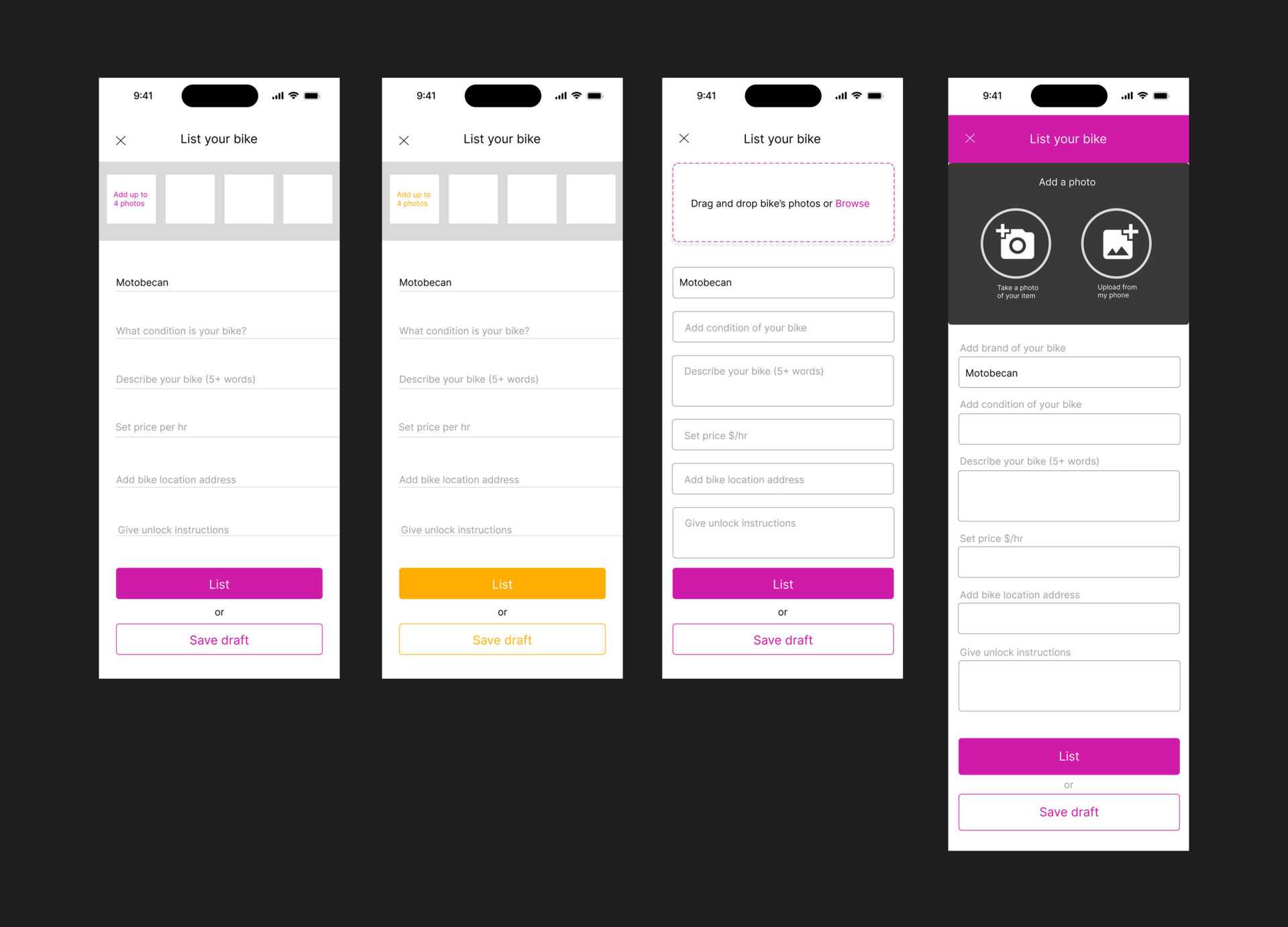
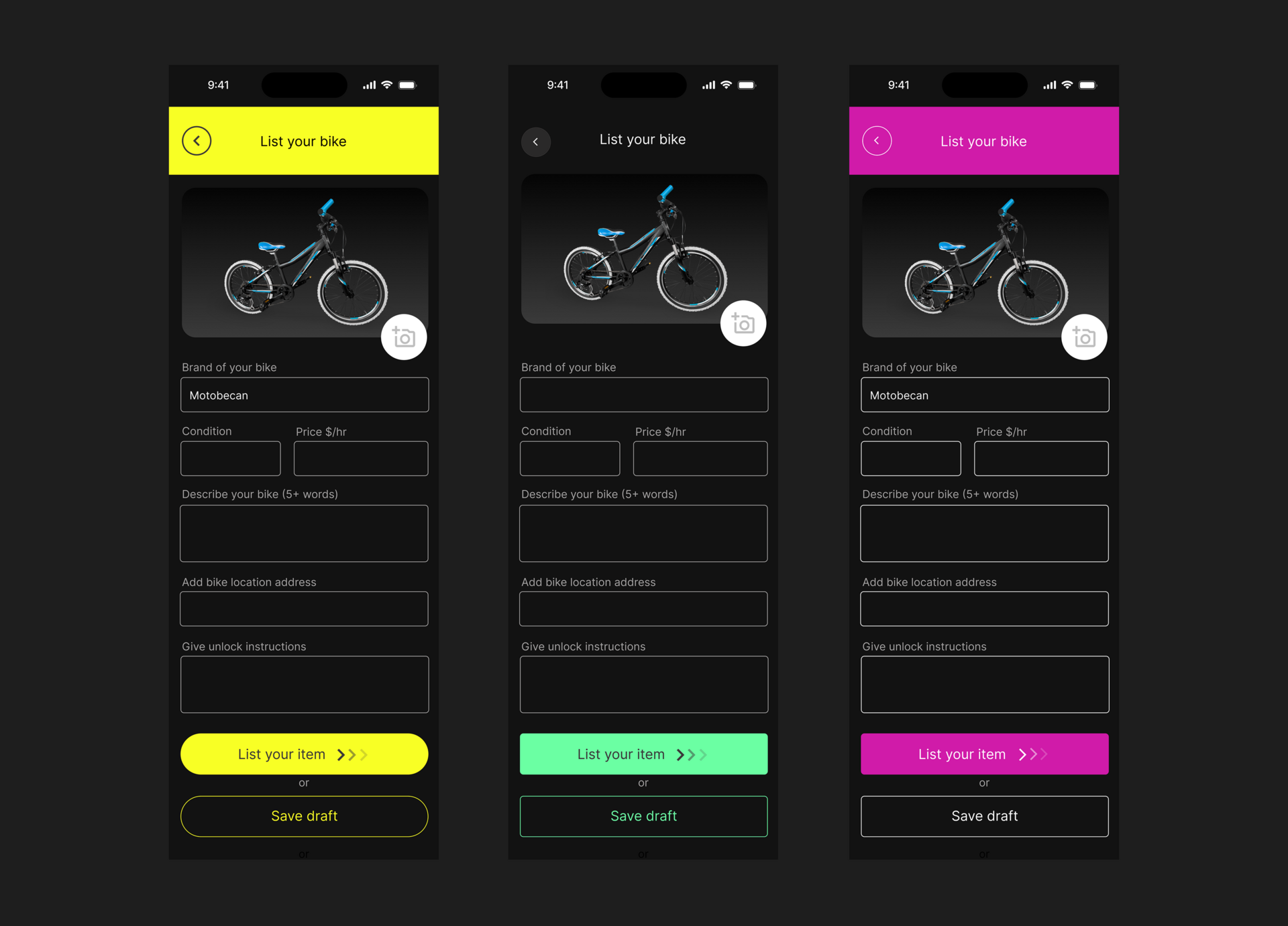
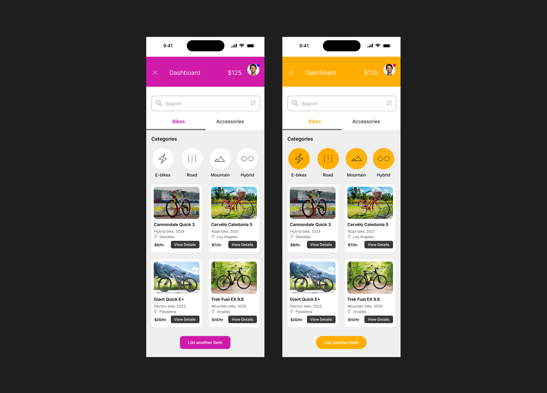
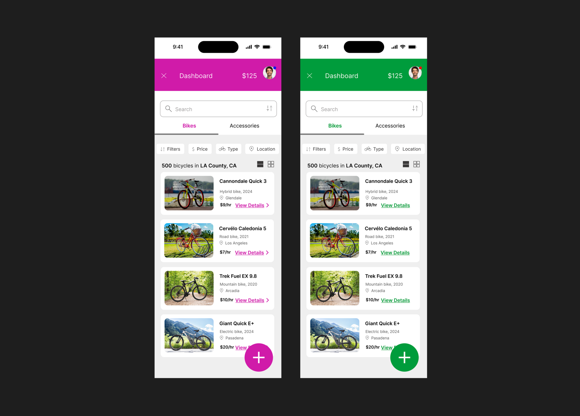
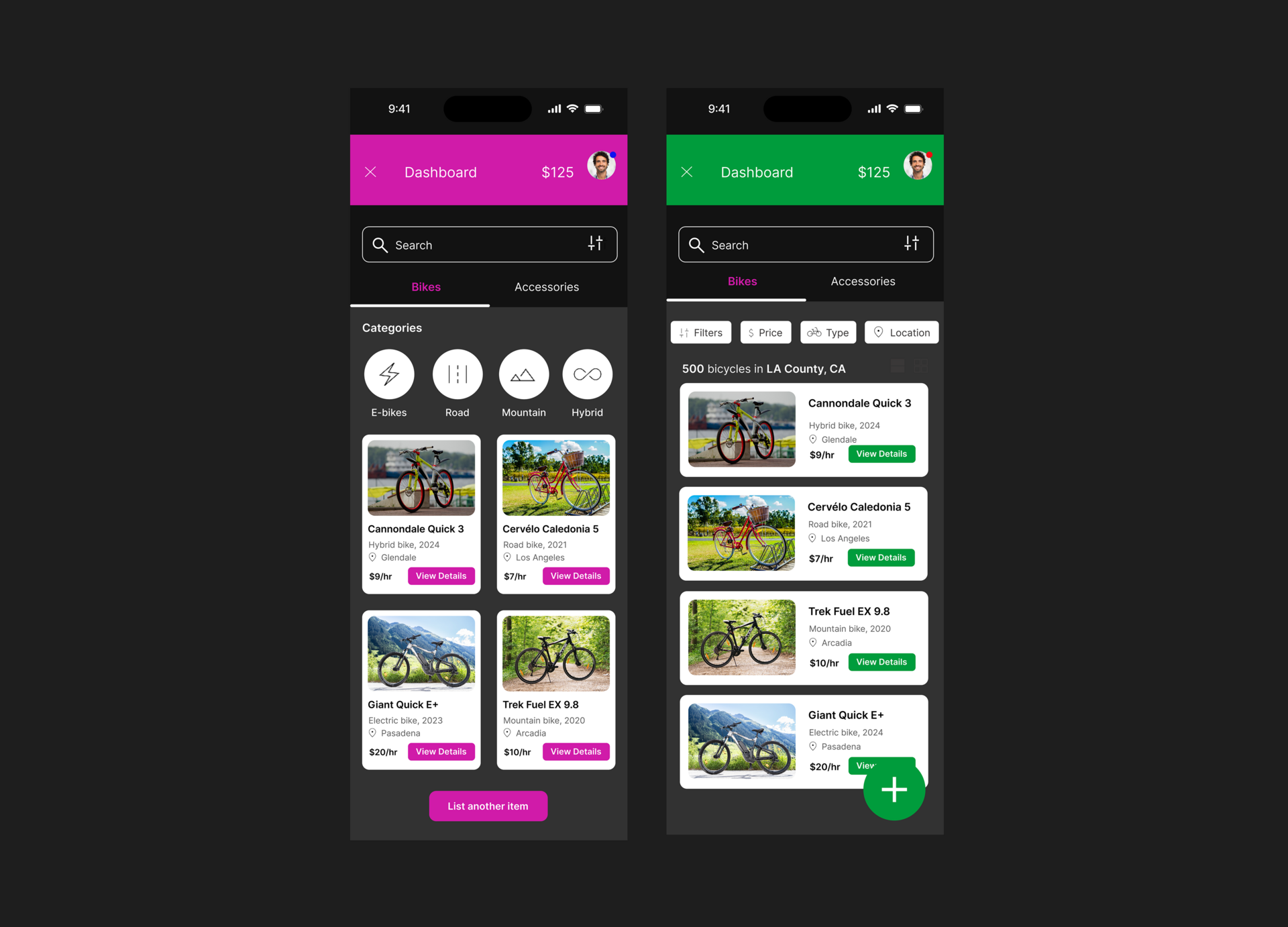
This screen explores design variations for the Lender’s flow, specifically the "List Your Bike" path. I experimented with different color palettes, button styles, and layout structures to evaluate usability, contrast, and brand tone. Each variation was designed to test how visual choices can impact clarity, engagement, and user preference without changing the core functionality.
Design System
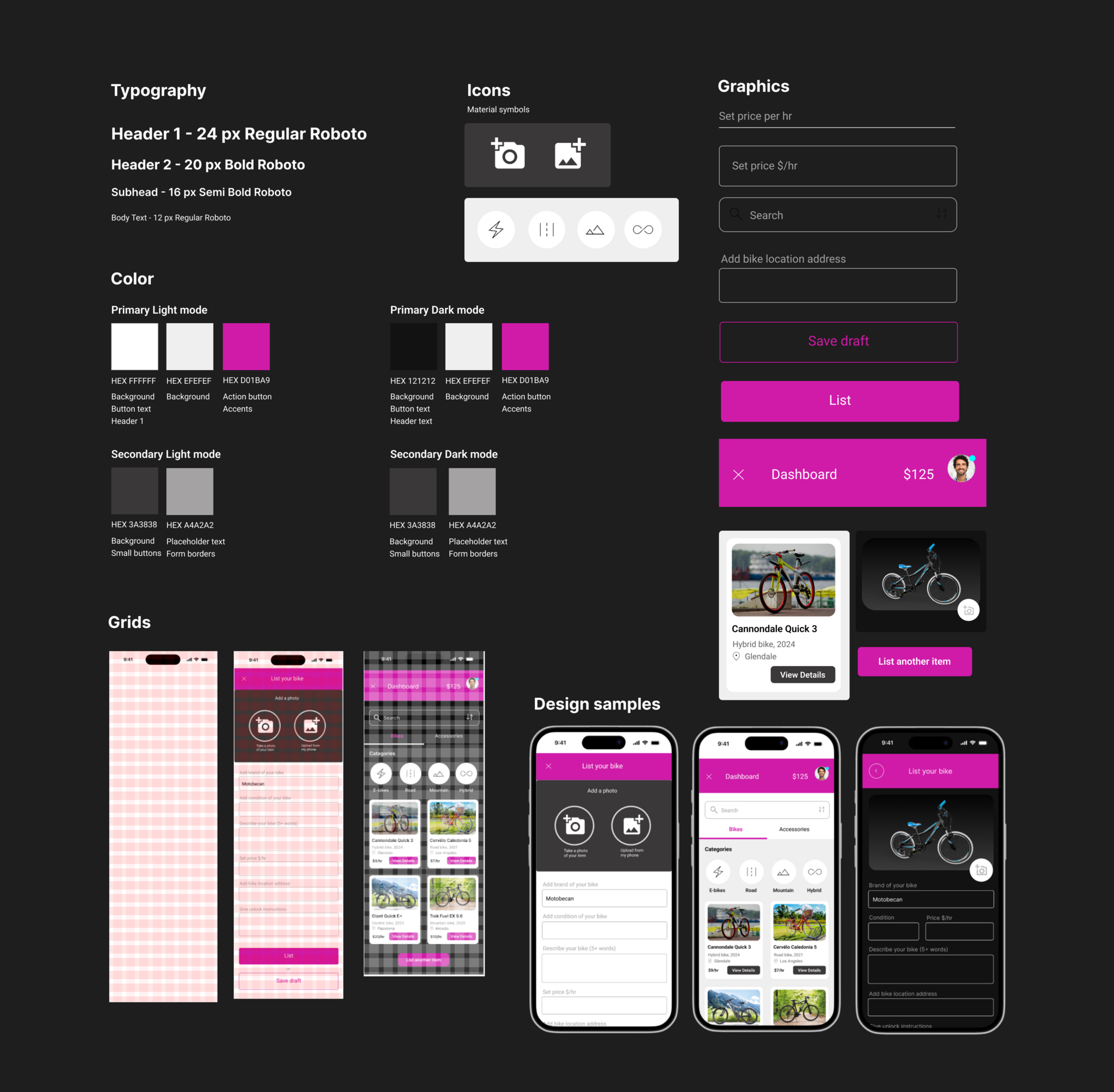
The design system ensures visual consistency and usability across the Velover app. It includes typography styles based on the Roboto family, a defined color palette for light and dark modes, and a set of custom icons using Material symbols. Components such as buttons, input fields, and cards follow a unified grid structure for alignment and responsiveness. These reusable elements helped streamline the design process and maintain a cohesive user experience throughout the interface.
Mockups
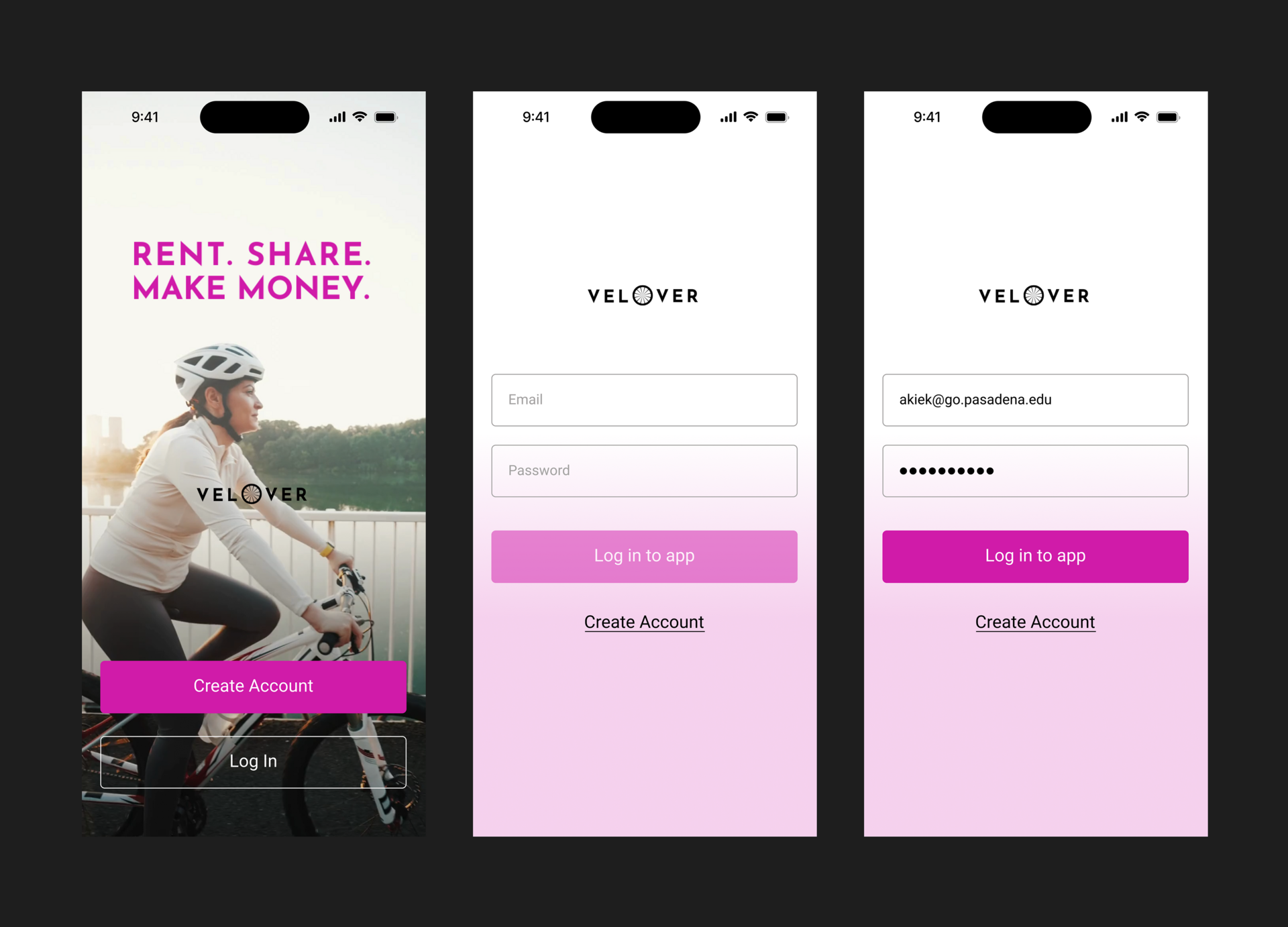
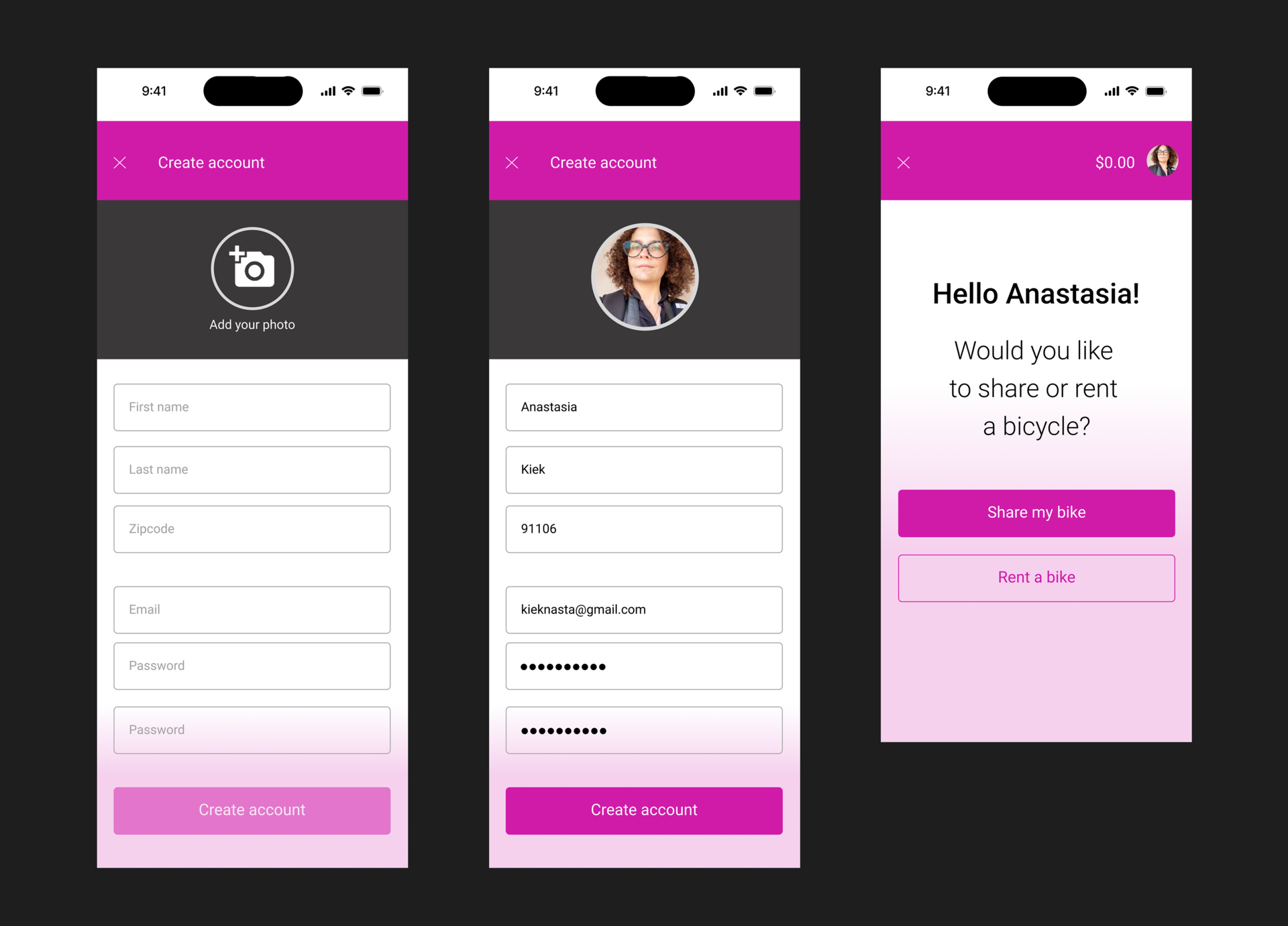
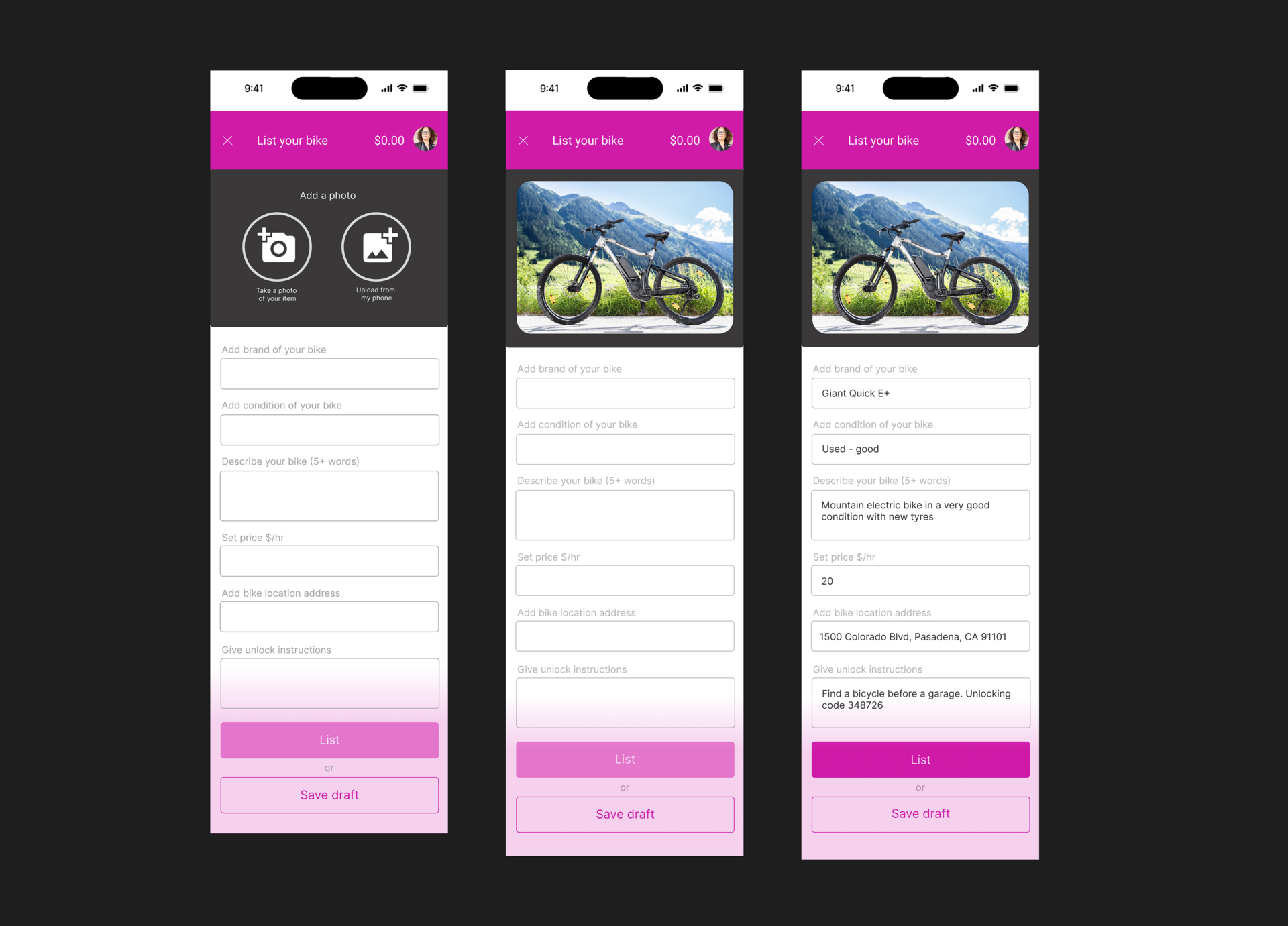
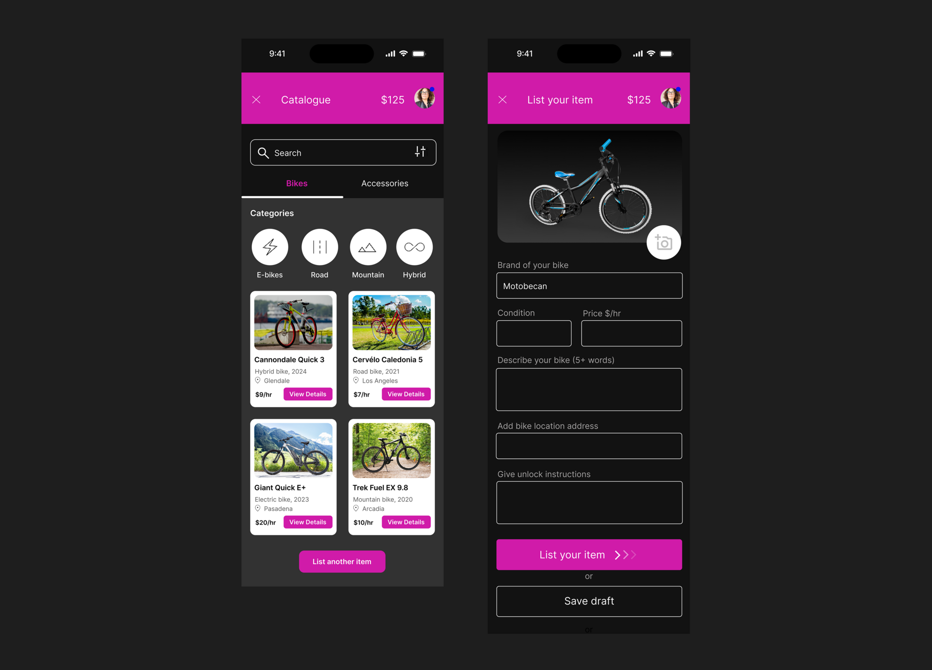
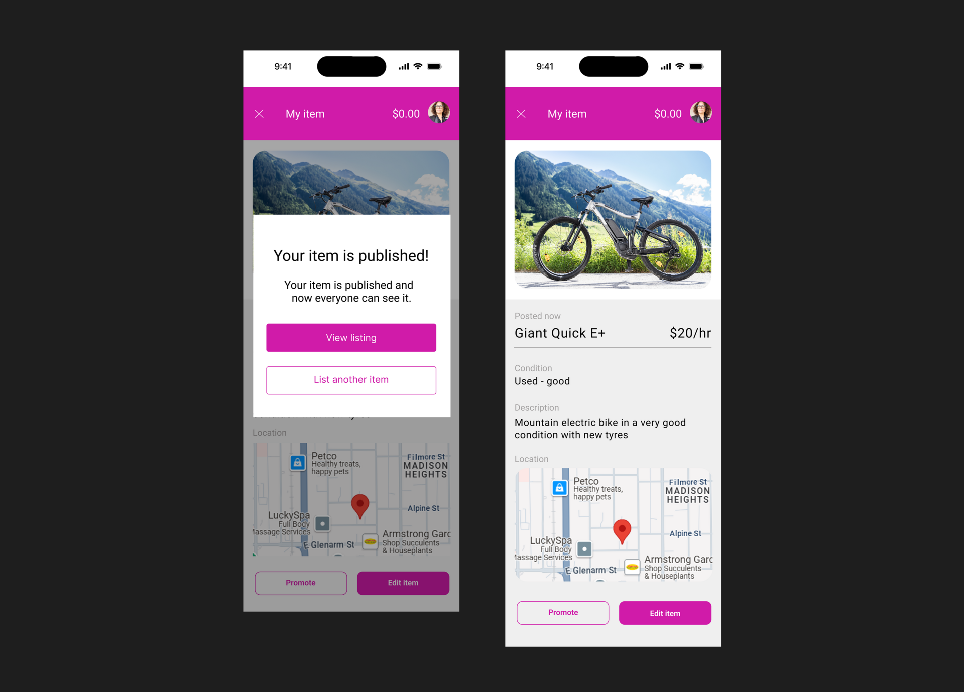
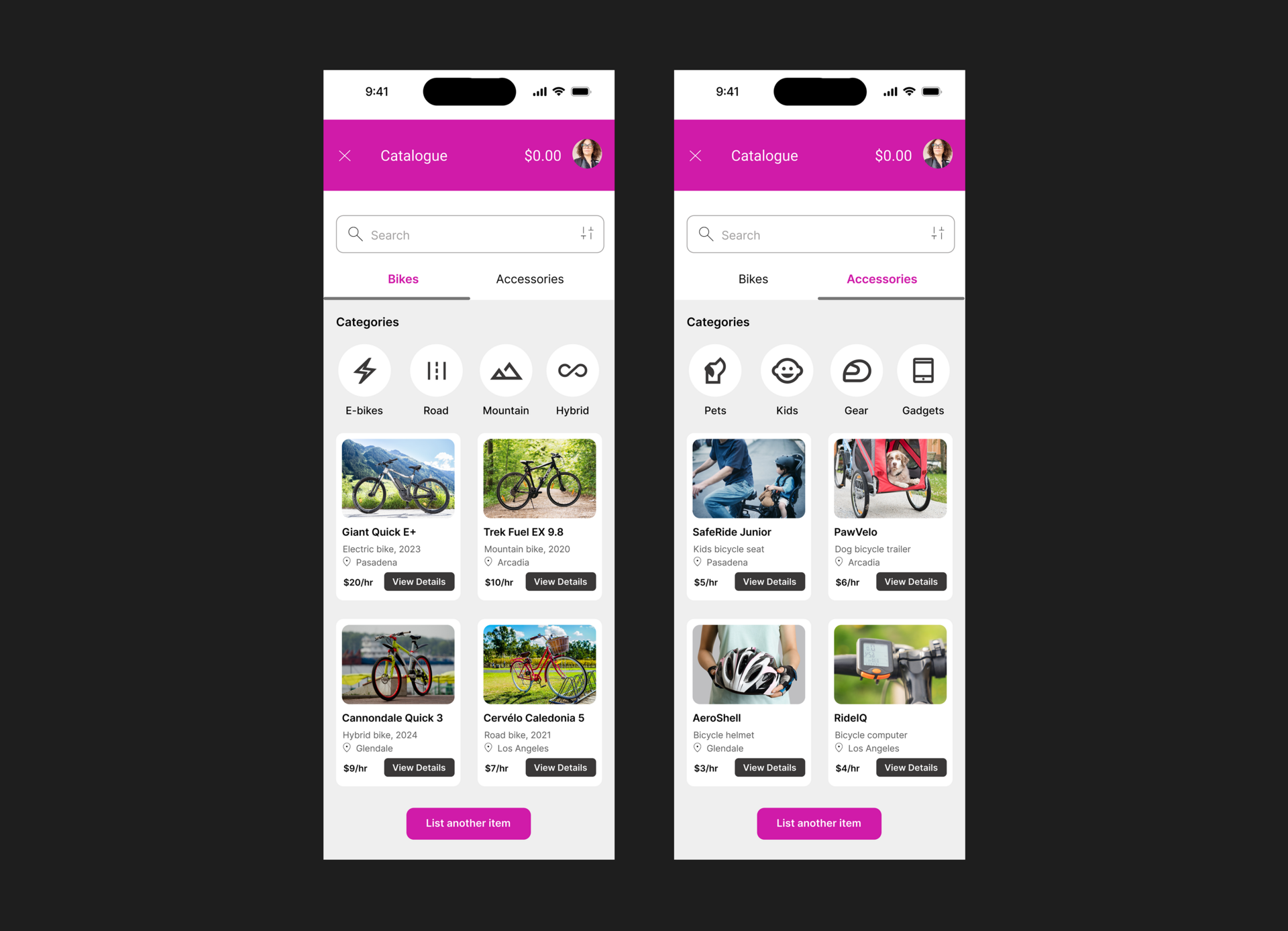
The high-fidelity mockups showcase the final visual design of the app, reflecting all key screens and interactions in both light and dark modes. From account creation and bike listing to catalog browsing and item publishing, each screen demonstrates the app’s user-friendly interface and branding. The mockups include real data, photos, and refined components that bring the experience to life. This stage helped visualize the polished product and communicate the final look and feel of Velover.
Prototype
You can explore the interactive prototype in Figma to experience the full user flow. Click the link to test key actions like account creation, bike listing, and catalog browsing. The prototype simulates real interactions and helps visualize how the app functions on a mobile device. Try it out to see how Velover works in action.
Open the prototype in FigmaTools: Figma