Westside Justice Center
Website design for a community legal aid organization
Project Overview
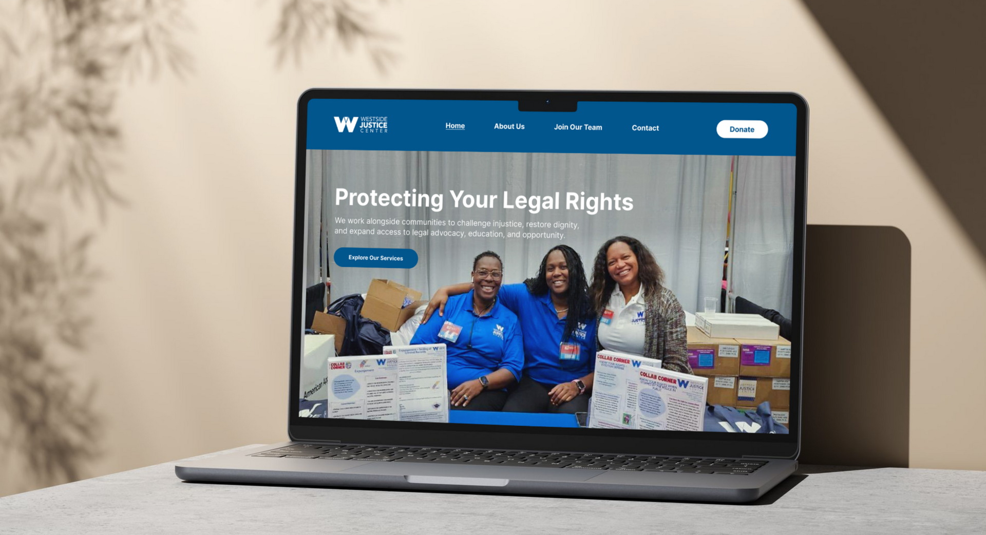
Westside Justice Center (WJC) is a community-centered legal aid organization that helps people protect their rights, restore stability, and access opportunity. The website introduces WJC’s mission, highlights key services (Housing & Eviction, Criminal Records Relief, Immigration Support, Estate Planning), and guides visitors toward clear next steps: Explore Services, Contact Us, Join Our Team, and Donate. The overall experience balances trust, warmth, and clarity, making legal support feel approachable and easy to navigate.
The primary goal of the redesign was to create a structured, accessible and welcoming digital experience that balances institutional credibility with warmth. Legal support can feel intimidating, so the website was designed to feel trustworthy, calm and easy to navigate.
Problem Statement
Legal aid websites often contain dense information, complex terminology and unclear navigation. Visitors seeking help are frequently under stress and need fast, clear access to services.
How might we redesign the Westside Justice Center website to make legal resources feel approachable, clearly structured and easy to access while maintaining credibility and professionalism?
Research Questions
- Who are the primary users of the website?
- What information are visitors seeking most urgently?
- How can we simplify legal terminology and keep it accurate?
- What navigation structure best supports service discovery?
- How can visual design reinforce trust and approachability?
Research Methods
- Competitive analysis of nonprofit legal aid websites
- Information architecture audit of the existing site
- Content hierarchy mapping
- Stakeholder goal alignment
- Accessibility review of typography, contrast and readability
Research Analysis
Research showed that people visiting legal aid websites are typically in urgent or stressful situations, so clarity and speed of access are critical.
Competitive analysis showed that many legal nonprofit websites overload visitors with dense paragraphs and unclear service categories. Information architecture mapping revealed the need for clearer separation between services, organization information and action-based pathways.
Key insights:
- Users need immediate clarity about the services offered
- Calls to action must be visible and repeated
- Navigation must stay simple and consistent
- The tone should feel human, warm and welcoming
These findings shaped the structural and visual redesign decisions.
Style Guide
The Style Guide reflects the visual identity and design language for the Westside Justice Center website, combining institutional credibility with welcoming community energy.
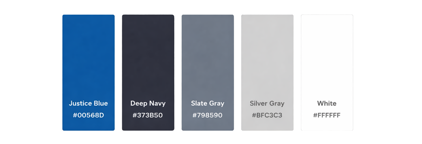
The color palette consists of five main tones:
- #00568D Justice Blue: primary brand color for top navigation, section backgrounds, and key UI elements.
- #373B50 Deep Navy: dark tone for contrast, headings, and a formal, stable layout feel.
- #798590 Slate Gray: secondary neutral for supporting text, subtle UI structure, and softer contrast than black.
- #BFC3C3 Silver Gray: used for dividers, borders, and background accents to keep pages clean and organized.
- #FFFFFF White: primary background color that keeps content readable, accessible, and airy.
The typography uses Inter, a modern, highly readable sans-serif font with strong hierarchy:
- Headlines: Bold and large Inter styles for confidence and clarity.
- Body text: Regular-weight Inter for clean readability and easy scanning, especially important for legal content.
- Buttons / CTAs: Medium to semi-bold Inter with high contrast to make actions obvious, quick, and accessible.
The photography focuses on real people and community presence: staff and supporters shown in candid, friendly moments. This builds trust and reinforces WJC’s people-first, approachable mission. Service cards use contextual imagery (documents, housing, consultation scenes) to communicate categories quickly without heavy text.
User Flow
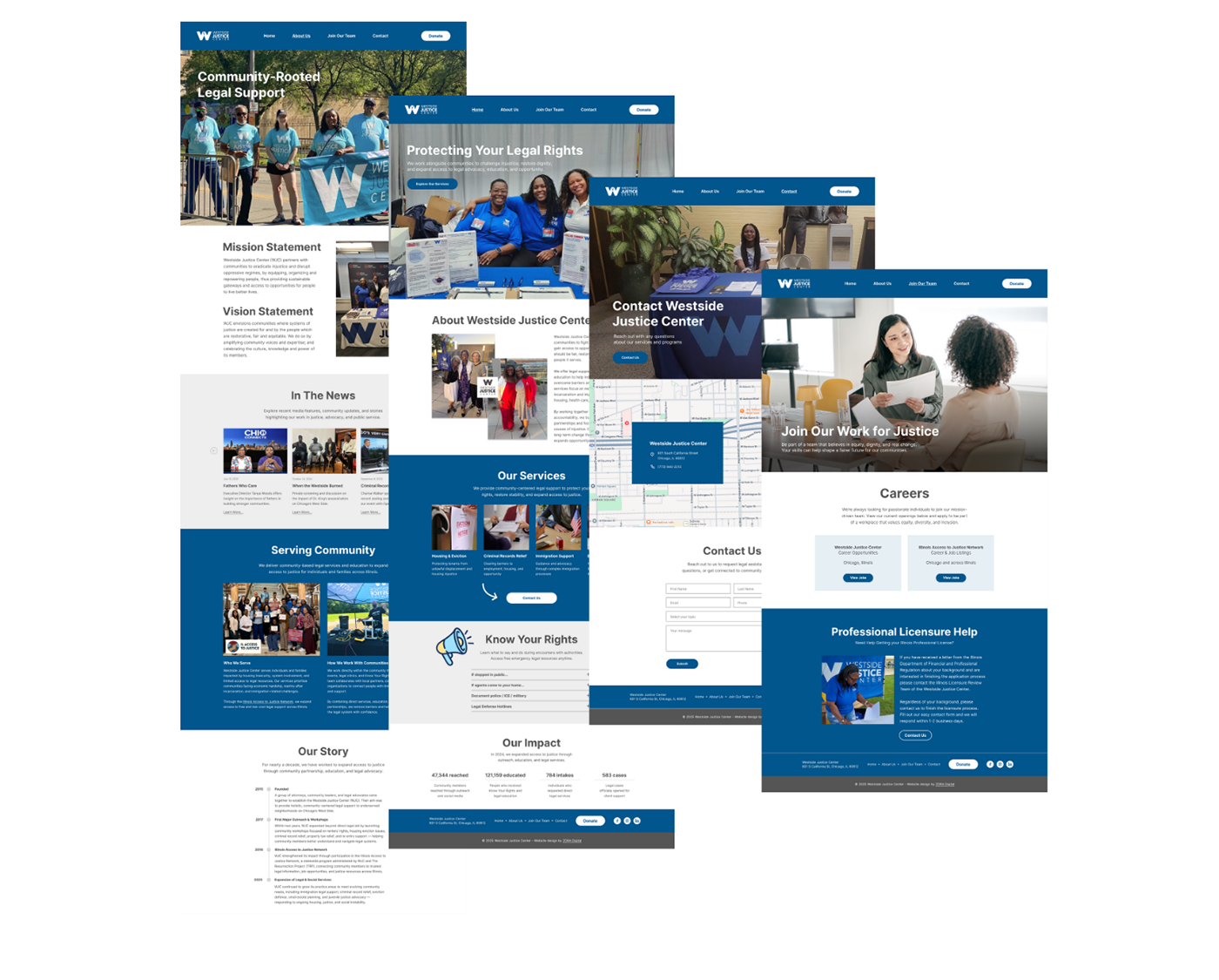
The website is designed with a clear and intuitive user flow that allows visitors to navigate easily and find information quickly. Global navigation is available in both the header and footer, giving users consistent access to all main sections of the site.
The website consists of four primary pages: Home, About Us, Careers, and Contact Us. Users can move seamlessly between these pages at any time, ensuring a flexible and frustration-free experience. Multiple contact categories help route inquiries efficiently, allowing requests to be processed quickly and accurately.
In addition, smooth navigation is implemented across the gallery, news articles, and video content, enabling users to explore the organization’s work, updates, and impact without disruption.
Digital Wireframes
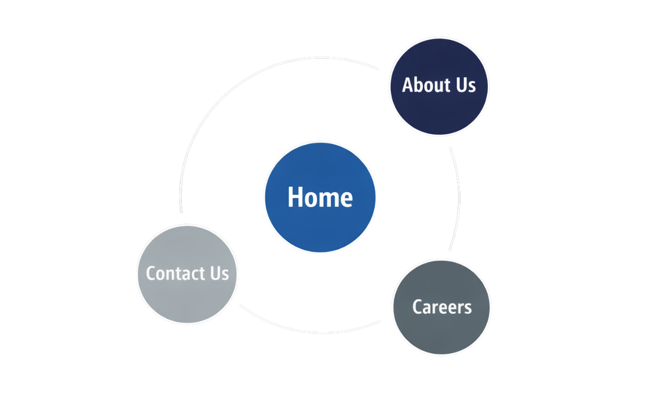
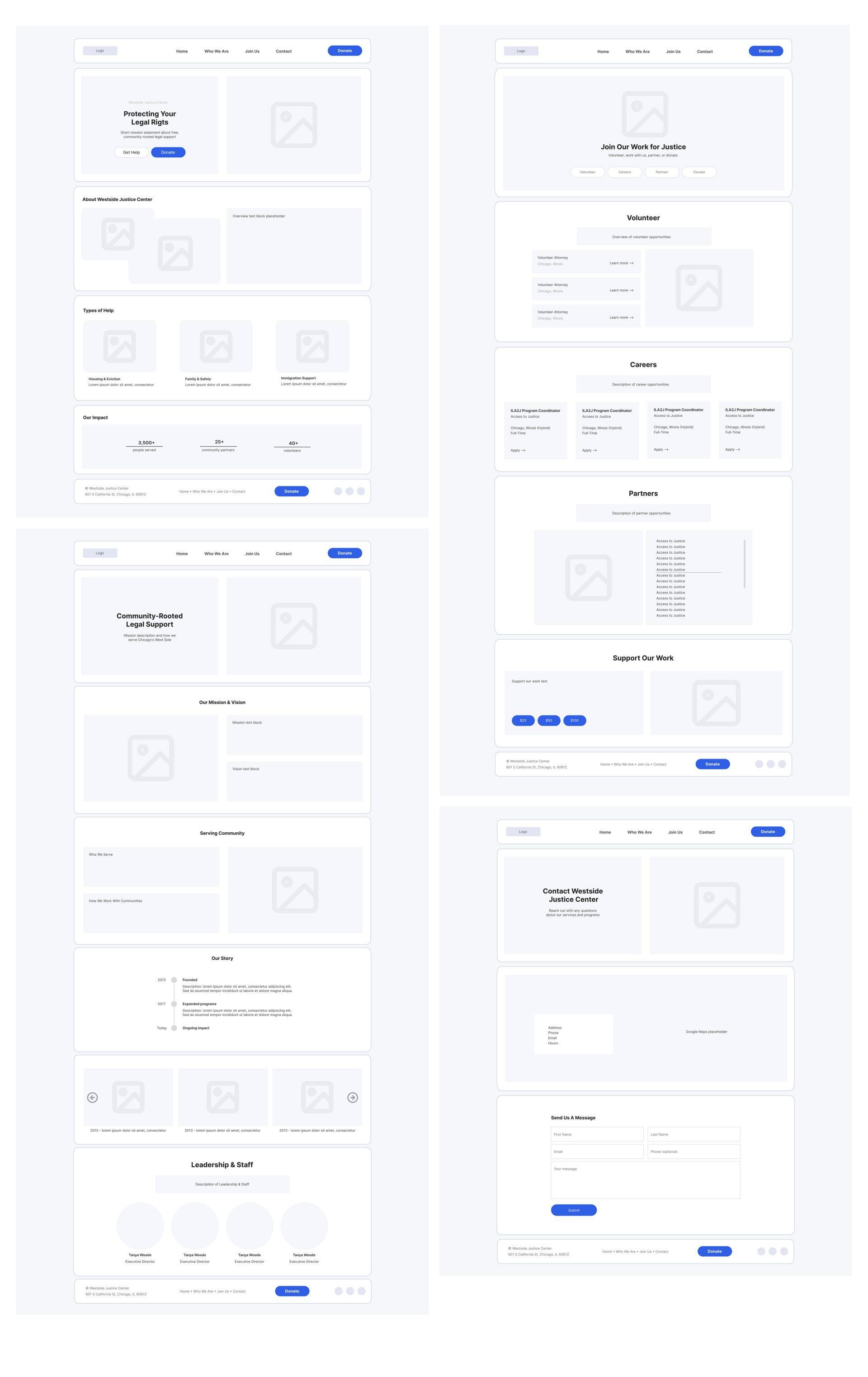
The wireframes for the Westside Justice Center website focus on clarity, accessibility, and ease of navigation. Each core page (Home, About Us, Careers, and Contact) follows a consistent layout structure with a persistent header and footer, ensuring users can move seamlessly throughout the site. Content is organized into clear, scannable sections using card-based layouts, allowing users to quickly understand the organization’s mission, services, and impact.
The wireframes prioritize key user actions such as seeking help, learning about programs, exploring career opportunities, and contacting the organization, while maintaining a calm and approachable visual hierarchy. This low-fidelity structure establishes a strong foundation for usability, responsiveness, and future visual refinement.
High-Fidelity Pages
High-fidelity mockups refine typography, color hierarchy, imagery and spacing.
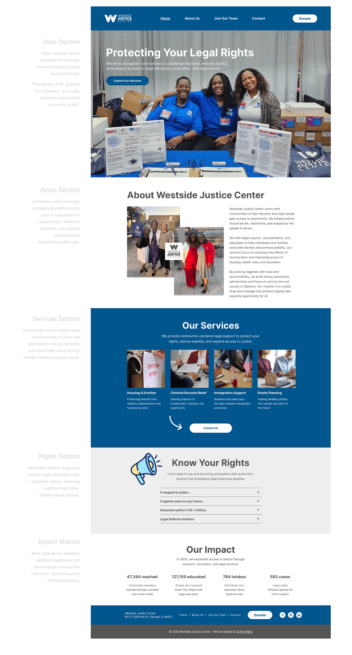
- The Home page highlights core services and key calls to action.
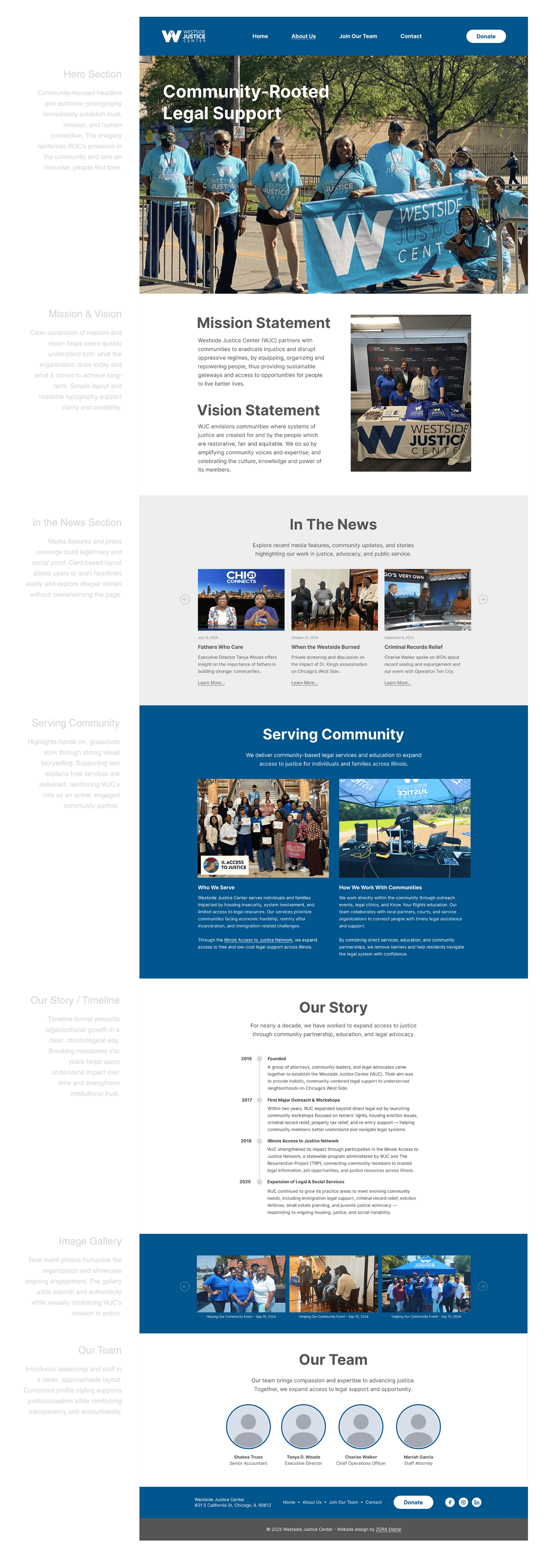
- The About Us page builds trust through the mission statement and visual storytelling.
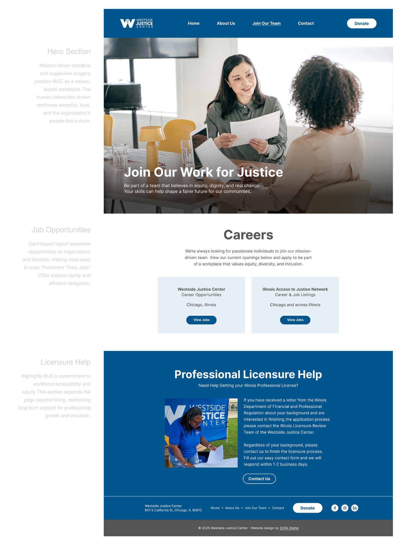
- The Join Our Team page supports recruitment with clear pathways to external job listings.
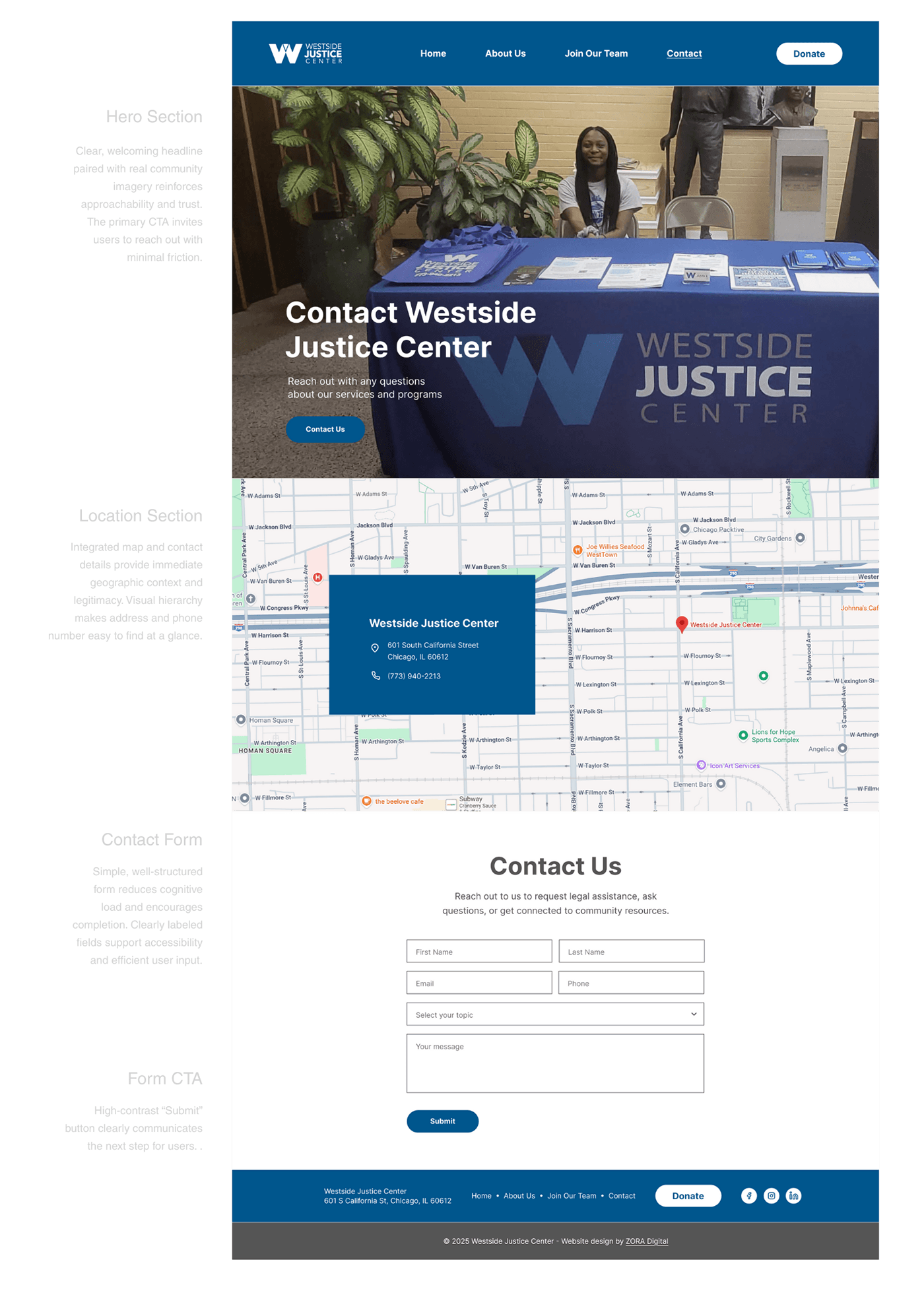
- The Contact Us page provides structured inquiry routing and accessible form fields.
The final design balances professionalism and warmth while keeping every page clear and accessible.
Home Page
About Us Page
Join Our Team Page
Contact Us Page
Prototype
You can explore the interactive Figma prototype to experience the full user flow of the Westside Justice Center website. Click through key actions such as navigating services, reviewing Know Your Rights resources, and submitting a Contact Us request.
Explore the News section to view videos and post-event press releases, and interact with the image gallery by opening photos in full size. You can also visit the Careers page to follow links to external job resources and return to Contact Us for next steps. The prototype simulates real interactions and demonstrates how the site supports accessibility, clarity, and community engagement in practice.
Open the prototype in FigmaTakeaways
- Clear service categories reduce cognitive overload
- Consistent global navigation increases user confidence
- Accessible typography improves the readability of legal content
- Warm imagery strengthens trust and community perception
- Action-oriented calls to action make it easy to ask for help, get involved and donate
Final Thoughts
The Westside Justice Center redesign shows how thoughtful information architecture, accessible typography and a community-centered visual language can turn a legal aid website into a clear and welcoming digital experience.
The redesign strengthens trust, makes services easier to find and supports people in urgent situations by simplifying their path to help.
Tools: Figma