Hook Point Fisheries
Online store design for a family fishing business from Alaska
Project Overview
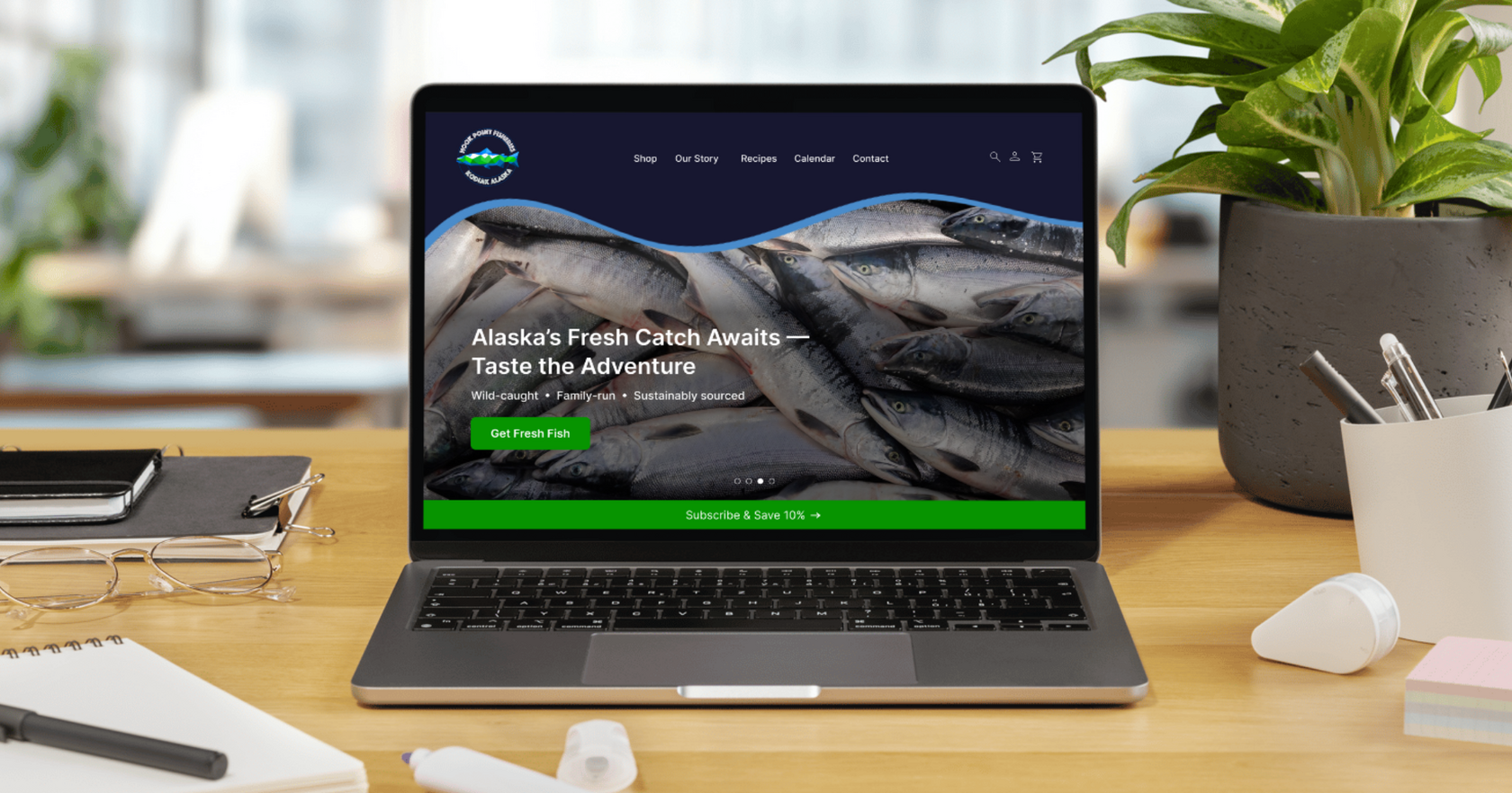
Hook Point Fisheries is a family fishing business from Alaska that sells wild-caught seafood through its online store and in person at local markets and its physical store. Their existing Shopify store worked for orders but looked dated and left most of their story untold.
The client wanted to grow online sales by giving the store a more inviting, modern design and a better shopping experience. They also wanted the new site to share much more about who they are:
- the fish they catch and how they catch it
- the people and the business behind Hook Point
- what wild-caught seafood is and why it matters
- where customers can buy in person, at markets and in the store
My task was to redesign the Shopify store so it sells the product and tells the story behind it, helping first-time visitors understand why Hook Point fish is worth choosing.
My Role and Scope
UX/UI Designer
- User research
- Wireframes
- Usability testing
- Design system
- High-fidelity pages
Problem Statement
Online seafood shoppers want to know where their fish comes from and whether they can trust its quality before they buy. Hook Point’s Shopify store presented products with little context, so the family story, the wild-caught Alaska sourcing and the places to buy in person stayed hidden from visitors.
How might we redesign the Hook Point online store to tell the story of a family fishing business, build trust in the quality of wild-caught seafood and make it easy to buy online or find the fish at local markets and the store?
Research Questions
Telling the family story
- What do customers know about the family behind Hook Point, and what would they like to learn?
- Which parts of the story (the family, the fishing, Alaska) make the brand feel personal and memorable?
Building trust in quality
- What tells shoppers that the seafood is high quality and truly wild-caught?
- What doubts or questions do shoppers have before ordering fish online?
Making it easy to buy online or in person
- What do shoppers need to see on a product page to choose and order with confidence?
- How do customers prefer to buy Hook Point fish (online, at markets, in the store), and what do they need to find it in person?
Research Methods
- Competitive analysis of four online seafood stores
- Information architecture audit of the existing Shopify store
- Stakeholder goal alignment
- Unmoderated survey
Research Analysis
I reviewed four competitor online seafood stores to see how they present sourcing, tell their brand story and guide shoppers to checkout. Then I audited the information architecture of the existing Shopify store and restructured it around two sets of goals: what shoppers need to buy with confidence and what the client wanted the site to achieve.
Next, I ran an unmoderated survey built on the research questions and mapped the answers to the stakeholder goals. The answers showed that shoppers want to:
- learn more about wild-caught seafood and what makes it special
- get to know the family and the people behind the catch
- find out where to buy Hook Point fish beyond the online store
- complete a purchase quickly and easily
- get clear, easy-to-find details about the product and delivery
These findings shaped the structure and content of the redesign.
Personas & Journey Maps
Based on the survey answers, I created two personas who represent the main groups of Hook Point shoppers and mapped how each of them moves from first visit to a repeat order.

Emily cooks healthy dinners for her family and does most of her shopping online in the evening, after the kids are asleep. She buys fish for its nutrition and wants the order done in a few minutes.
“I have ten minutes before bedtime. The order has to be quick and clear.”
Goals
- Order quality fish in a few minutes
- See the price, portion size and delivery date upfront
- Get her family favorites on a regular schedule
Frustrations
- Long checkouts with many steps
- Shipping costs that appear only at the end
- Small buttons and crowded pages on her phone
What she needs
- Clear prices and portions on product cards
- Large Add to Cart buttons and express payment
- Subscribe & Save for regular deliveries

Mark plans his meals around training and reads labels before he buys. He wants to understand where his food comes from and why wild fish is a better choice for his health.
“Before I buy, I want to know where my fish was caught and why it is better.”
Goals
- Learn where and how the fish was caught
- Understand the benefits of wild fish over farmed
- Buy from people he can trust, online or at a local market
Frustrations
- Vague claims like premium quality with no details
- No information about sourcing or the people behind the brand
- Having to search other sites to compare
What he needs
- A clear Wild page that explains wild versus farmed
- The family story and how the fish is caught
- Farmers market and event schedule, plus real reviews
Journey Map: Emily
Journey Map: Mark
Emotional Journey
Both journeys dip in the middle: Emily is unsure about portions and price, and Mark is careful until he sees sourcing details and reviews. Clear product cards, the Wild page and visible reviews lift both curves toward a confident purchase and a repeat order.
Visual Direction
I started with three moodboards to explore how the brand could feel online:
- Scandinavian Minimal: clean, light layouts with plenty of white space, calm natural tones and large product photography.
- Dark Coastal Craft: dark, atmospheric backgrounds, strong high-contrast photography and a minimal but bold layout with emotional depth.
- Playful & Illustrative: real photography combined with illustrations, light graphic elements over photos and subtle motion like waves and fish.
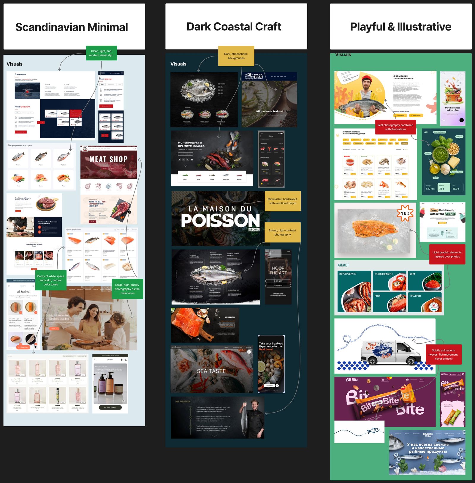
Three moodboards: Scandinavian Minimal, Dark Coastal Craft, Playful & Illustrative
The client chose Dark Coastal Craft as the base and asked for playful touches. The final design pairs deep navy sections and real photography of the catch with wavy section dividers, light sky-blue backgrounds and bright, friendly buttons.
Research
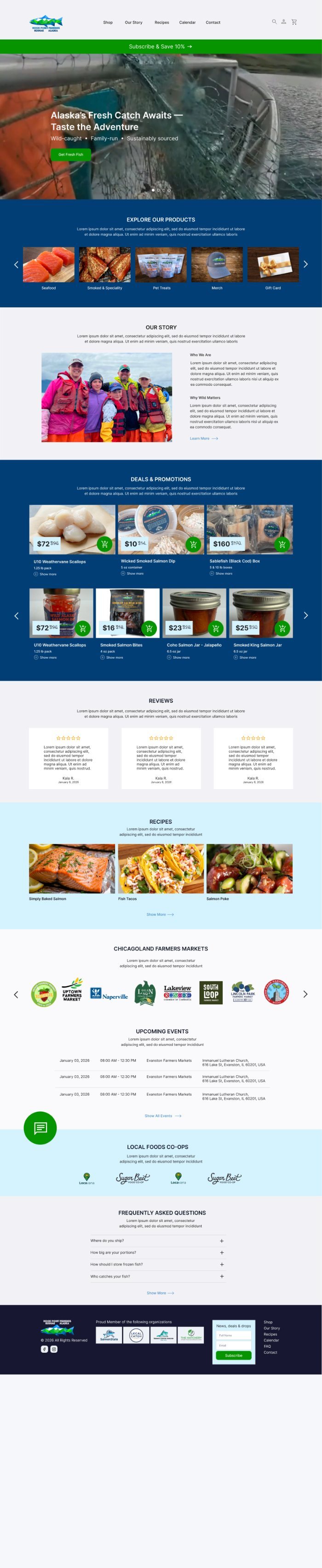
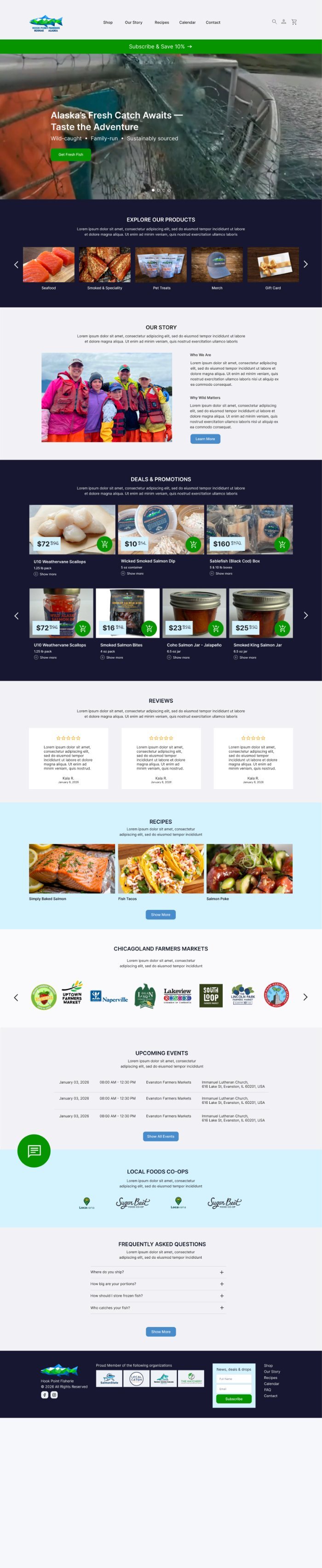
Before choosing a direction, I designed several versions of the key pages in Figma and ran an unmoderated survey to see which version users preferred. The owner preferred a nautical-themed version. Most users preferred the version where prices and order buttons were easier to see. I used both results in the final design: the ocean theme stays in the wave motif, and prices and buttons stay large and clear.
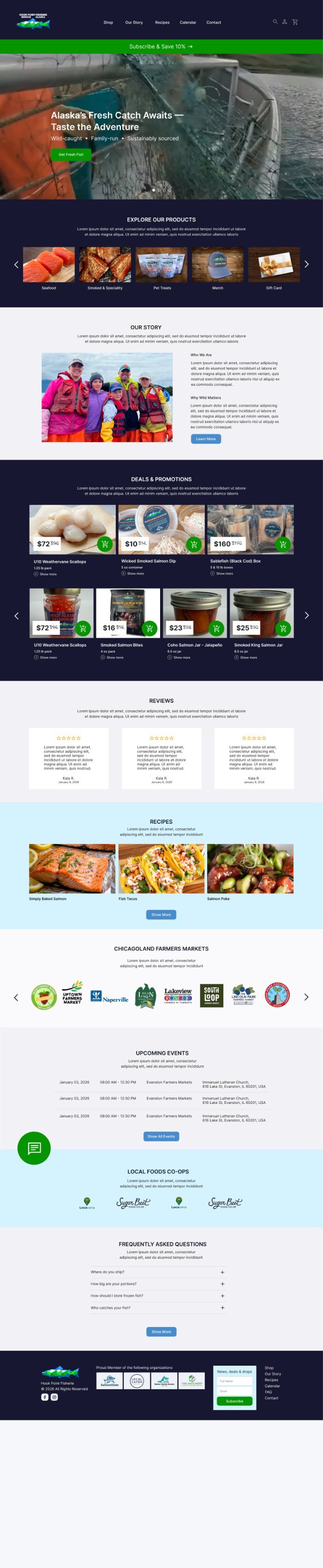
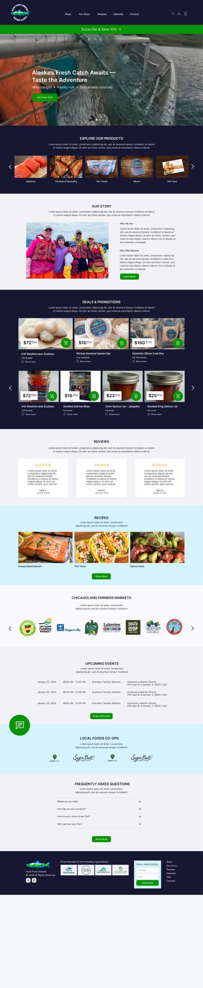
Homepage Directions
Homepage versions with different hero treatments, section order, product cards, and the events block.


Style Guide
The style guide reflects the final homepage design.
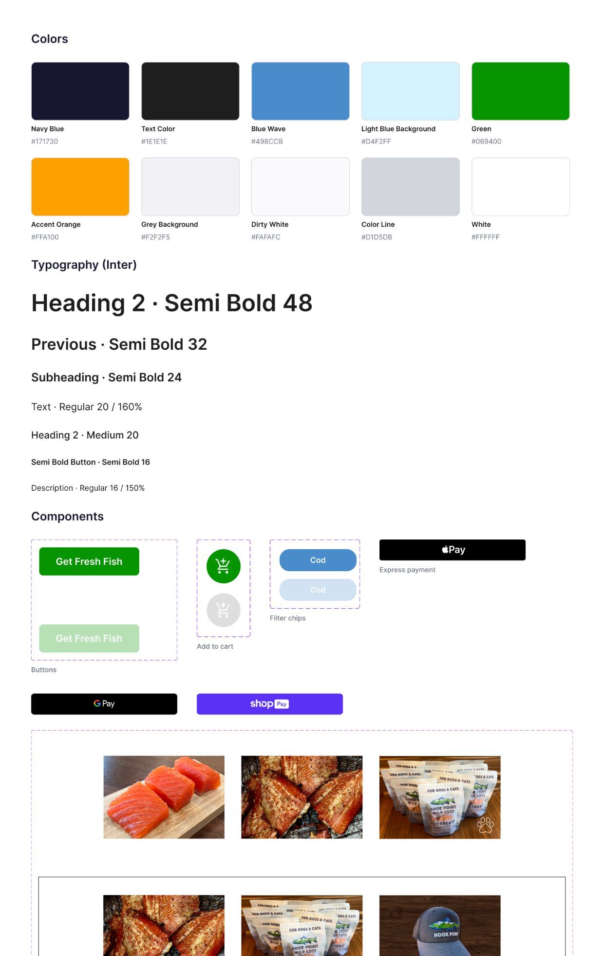
Color Palette
Typography
Inter for headings, body and buttons. Mulish for small "Show more" links.
Alaska's Fresh Catch Awaits
Our Story
Wild-caught • Family-run • Sustainably sourced
Sablefish (Black Cod) Box
$72 $96
We are a family fishing business from Alaska, bringing wild-caught seafood to your table.
Show more →
Buttons and UI
Corner radius 10 px on buttons, cards and images.
Design System
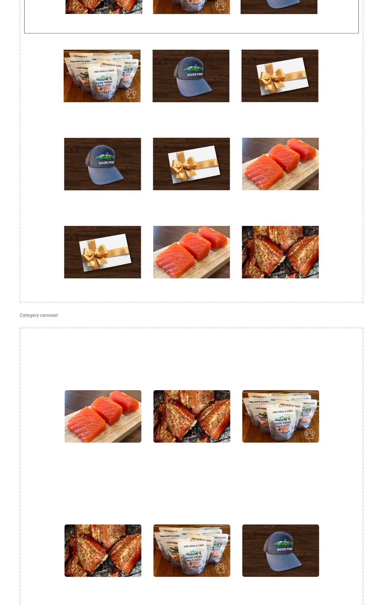
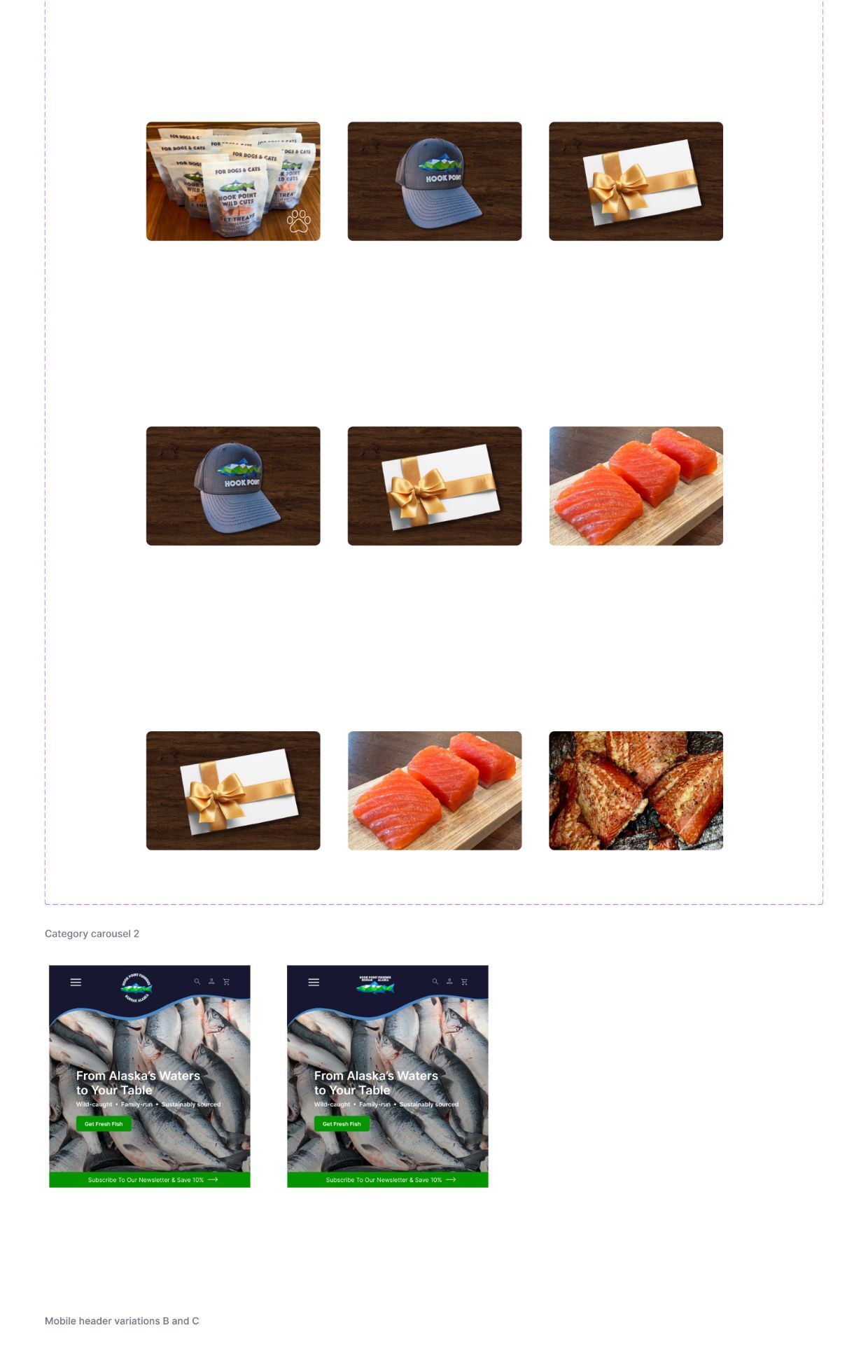
I built a design system for the site: color variables, Inter text styles, and reusable components for buttons, add-to-cart controls, filter chips, category carousels, headers, and express payment buttons.
Wireframes
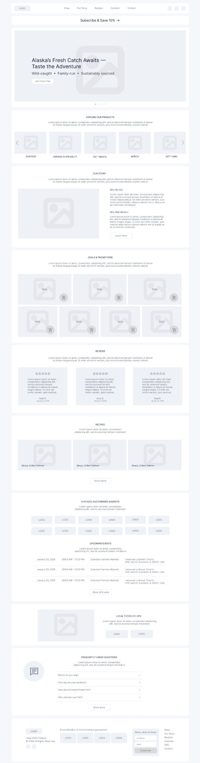
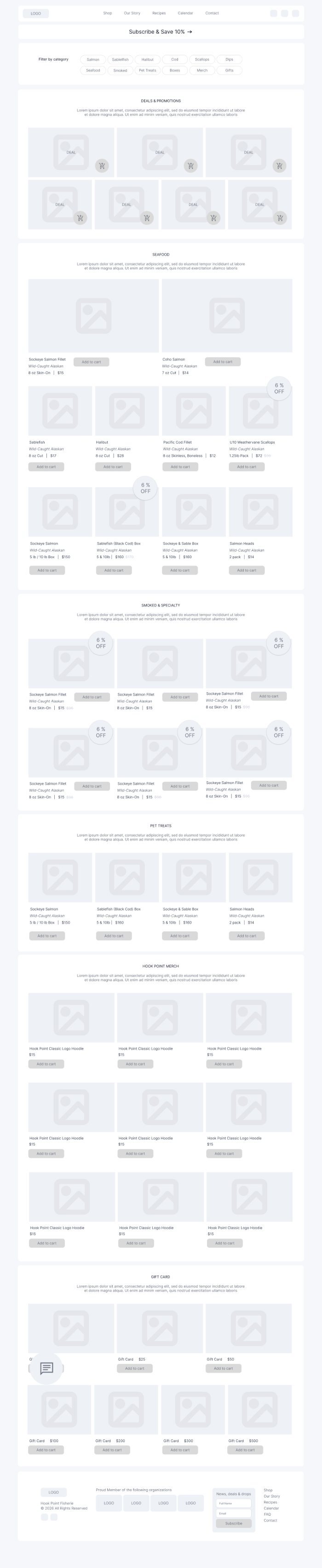
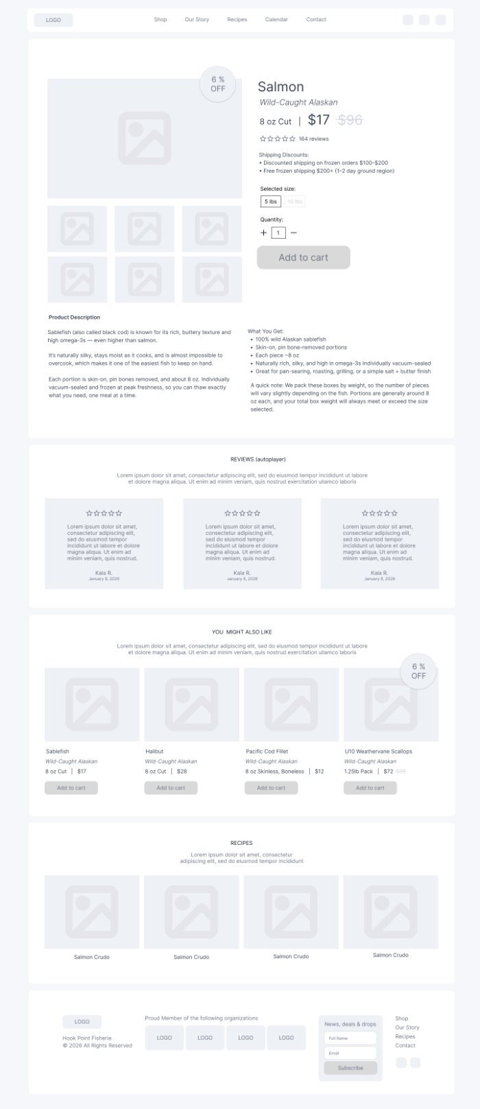
Low-fidelity wireframes set the page structure and content hierarchy for the store before any visual design.

Usability Testing
I ran usability tests with 10 participants and two scenarios.
- Scenario 1: find specific products, add them to the cart, and complete a purchase.
- Scenario 2: find out why wild-caught fish is a better choice than farmed fish.
What I changed after testing:
- Larger buttons and larger prices, so users could spot them and act quickly.
- The Wild page is now reachable directly from the homepage.
- The Wild page content is organized into shorter blocks with clearer text and supporting images.
High-Fidelity Pages
The final design uses a wave motif across every page, connecting the store to the ocean and the fishing life behind it. I created these pages with AI-assisted prototyping in Figma Make, built on the design system.


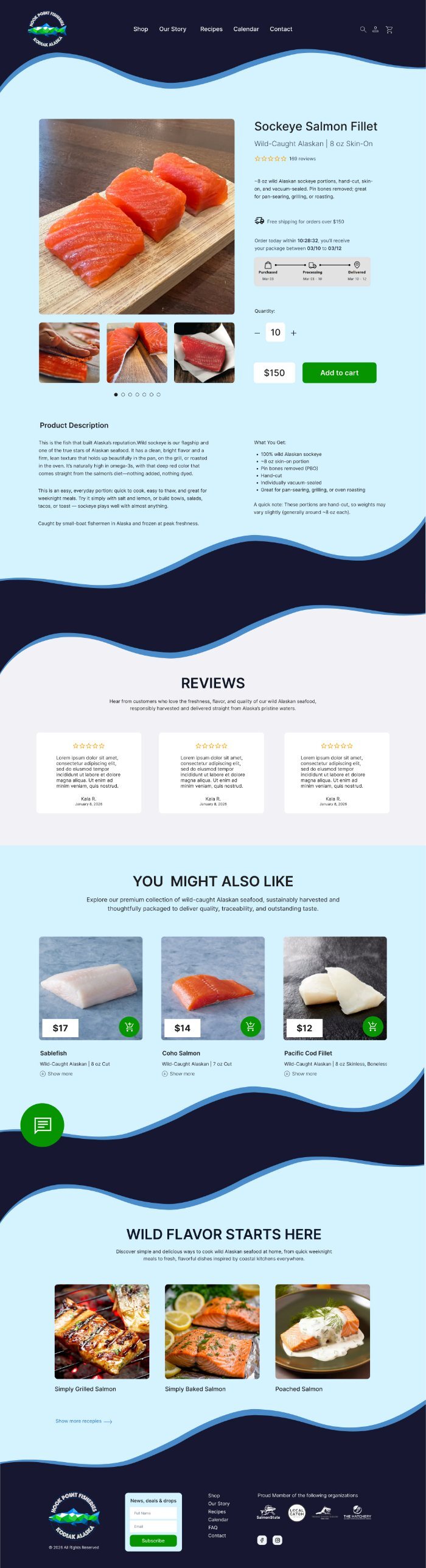

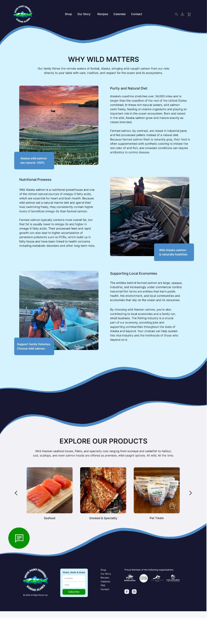
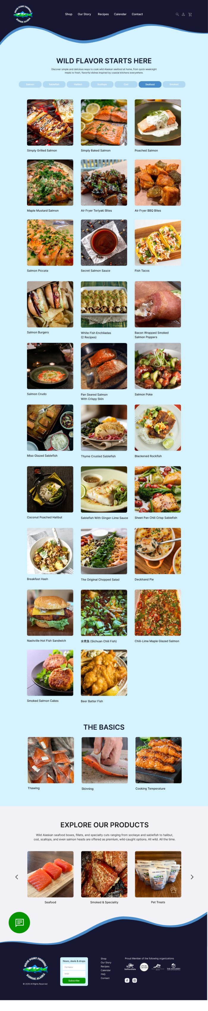
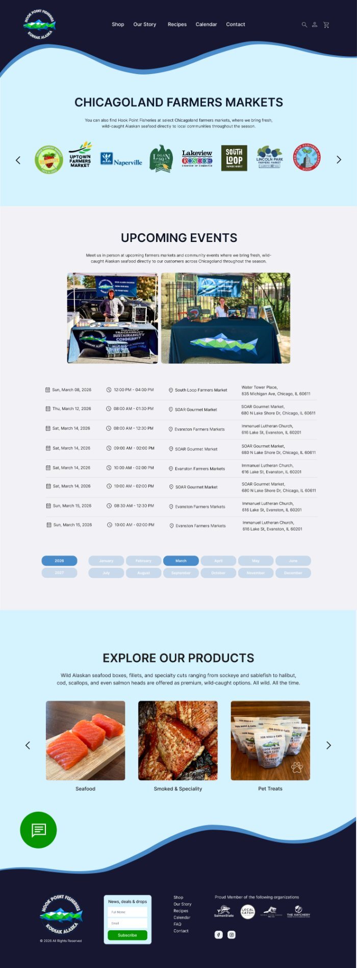
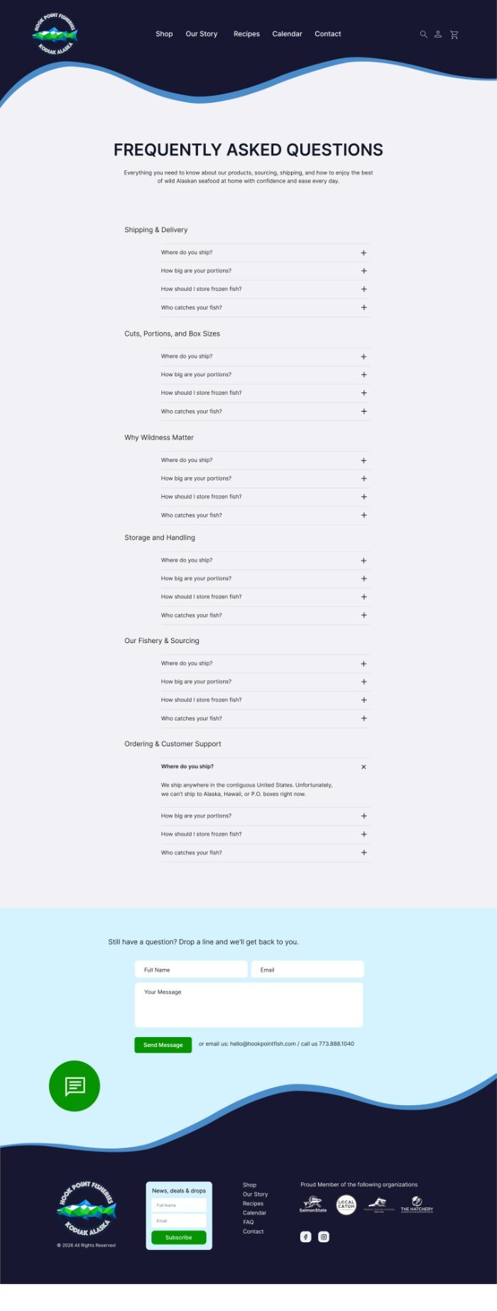
Click any screen to open the full page.
Checkout Flow
Cart, shipping details, payment, and confirmation.
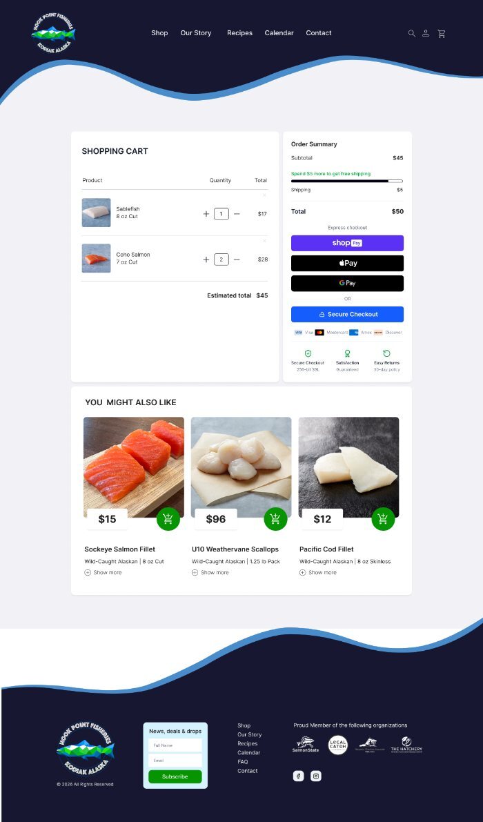
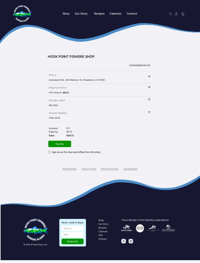
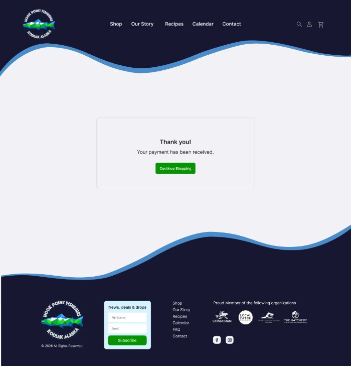
Click any screen to open the full page.
Mobile

Click any screen to open the full page.
Tools: Figma, Figma Make